10 Outstanding Retro Typography Artworks on Music Album Covers
1Album covers are known for their creative use of typography and other graphic design elements. Without this creativity, many albums most likely wouldn’t have grabbed as much fan attention and would not have achieved the same amount of fame.

While capturing the essence of a band’s music in a design is a difficult feat to achieve, these 10 examples show creativeness in using graphic design and retro typography combined to create a masterful album covers.
Radiohead: In Rainbows
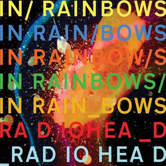
Nothing less than in-your-face uniqueness could be expected from Radiohead album covers. The cover for the “In Rainbows” meets and exceeds this expectation with its combination of loud colors and retro typography.
The Sex Pistols: Never Mind the Bullocks
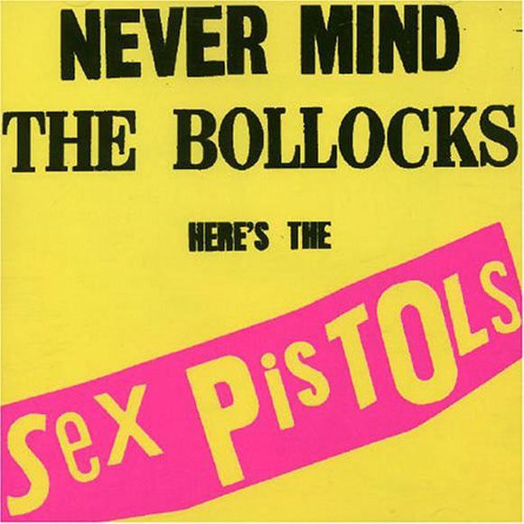
It’s simple yet amazingly bold. The cover for the “Never Mind the Bullocks” portrays a splendidly retro feel. The bold colors and jagged text perfectly complements the musical style of The Sex Pistols.
Lee Morgan: The Rumproller
Lee Morgan: The Rumproller
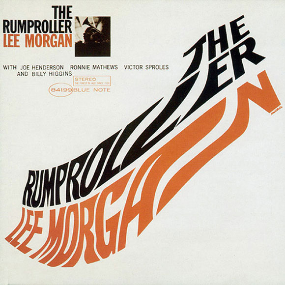
There is no missing inspired retro element of the album cover for “The Rumproller”. By using bright color complements and capitalized typography, this artwork is a great retro example.
The Beatles: One
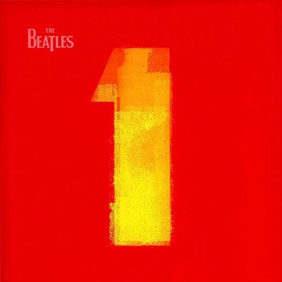
The Beatles are arguably the best retro band to release masterful album artwork. The cover for their album “One” is a great example of how a minimalist retro approach can be more effective than an overabundance of design elements.
ACDC: Powerage
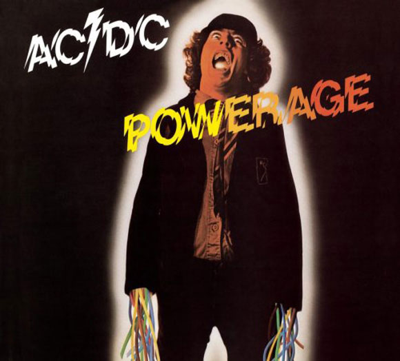
ACDC is known for the distinctive retro text commonly used for the name of their band. However, the album cover for the “Powerage” took a different approach with an electric, retro feel.
Daft Punk: Discovery
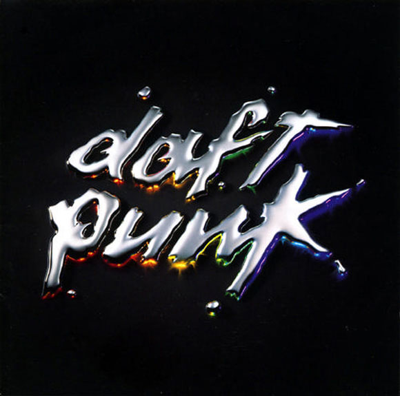
The artwork for the “Discovery” album gets straight to the point with its fluidity and colorful typography. This typography is truly retro at heart with a slight touch of modernism.
The Rolling Stones: Rolled Gold
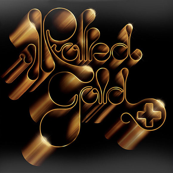
The Rolling Stones have accumulated a massive fan base over the years. As such, they couldn’t disappoint with their “Rolled Gold” album cover artwork. Elegant, stylish, and beautifully retro, the graphic design and typographical elements of this cover helped define The Rolling Stones as one of the world’s greatest bands.
Black Eyed Peas: Behind the Front
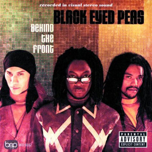
The album cover for “Behind the Front” shows how a modern band can still effectively use retro typography in their designs. In times when everyone else is being modern, it may be the perfect chance to turn the other way around with a unique retro approach.
The Doors: The Doors
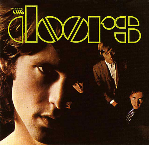
A dark and fantastically retro, the image and typography compilation for this album cover aided in the success of “The Doors”.
The Who: Then and Now
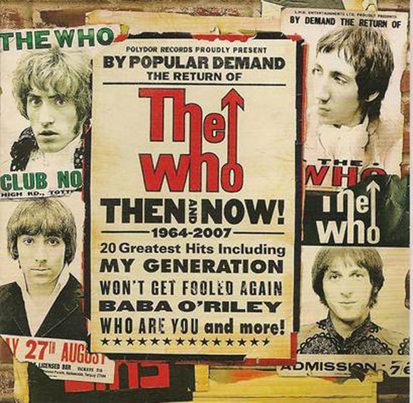
Although this album was recently released, it fully capitalizes on the band’s traditional retro image. The album artwork for “Then and Now” is a great example of how past successes can be built upon in the present.
While albums are no longer delivered as they were in past, the use of effective album image designs remains extremely important. Retro typography in album artwork can be viewed to gain inspiration on how to effectively merge the past with the present and catch consumer attention.


great collections