Nine Fonts to Use and Avoid in Design
2There are hundreds of thousands of fonts available on the internet, some of them free and some of them may be a bit pricey, but with such a large collection to choose from, which are good fonts to use and which are the ones to avoid?
We’re not talking about design only, but also about webdesign and how you employ these fonts on the internet. Besides colors, lines, size and other aspects, the font type is also an important decision to make while designing a website or creating a brand identity.
Stylish fonts do not have to be chosen only because they look good, because the negative effect they can produce is easy to think of: it is difficult to read them. This may result in people not being able to properly read a logo or to be able to follow a text and as a result, even if the subject looks good, they might click away from it.
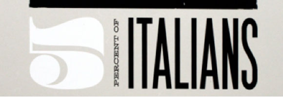
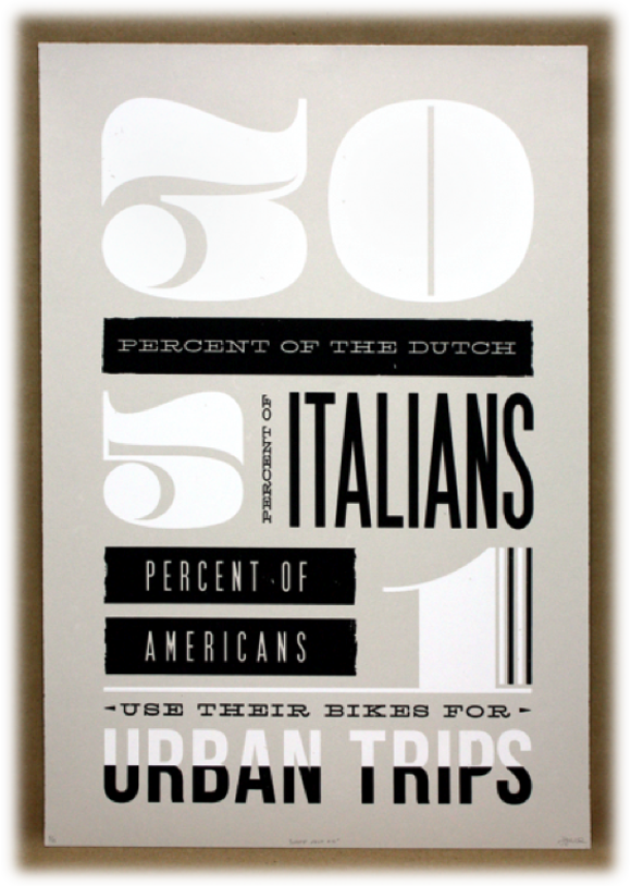
Pompadour Numeral Set is a beautiful and large numeral font available for free from here. The font is obviously not intended for webdesign, but for logo design. However, it can also be employed in minimalistic websites, with large white spaces and a big font size. The font can be easily combined with other types of fonts, especially with very tall letters, like in the picture below.
Piron is one of those fonts which, once used, you’ll never let go. Piron can be downloaded from here, it is free as well, and can be used for much more than webdesign or logo design. Brochures, flyers, magazines, covers, or business cards – you can use this font on all of them. Piron comes in two different versions, the difference between them being spacing, kerning and size.
The picture below shows the newest and most recent version of Piron and an example of employing it successfully. It works very well with different colors, but I don’t think this is the version to use if you want to employ this font as a typeface for a large block of text. You might want to use the other one for this purpose.

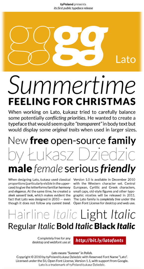
Although it is a very simple font, Lato is a good choice for design as well. Lato is a sans-serif which can be used for both webdesign and desktop. The font comes with five weights and includes Western character set, while the other sets are expected to be released this year. You can download the font from here.
Lato is part of the sans-serif family and displays original traits when employed in larger sizes. The letterforms have harmony and elegance and give a feeling of warmth thanks to the semi-rounded details of the letters.
As seen in the picture below, Lato works very well with other fonts, which offers a lot of variety and possibilities when designing.
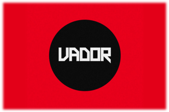
The fourth font we take a look at is Vador, which is especially good for logo design and minimalistic websites. Vador is developed by the deviantART community and works at its best when used in large sizes. You can download Vador from here, but you will have to pay $19 for it.
The font has a retro look, but I don’t think it fits very well with other typefaces, so I think it’s better to only use it on its own. This is just not the type of font which can be mixed with other ones.
Another free font I am in awe of is Caviar Dreams, which can be previewed and downloaded from here. It looks similar to many other fonts in the sans-serif family, but offers a modern look thanks to the small width of some letters, spacing and the nonconformist lines of some of the letters (e.g. “e”).
The font can also be used for logos and webdesign, but I think it can be used at its best in brochures and magazines, where there is a lot of space to play with. A medium-sized block of text with Caviar Dreams would not fit into a narrow column of a website.
In webdesign, like many other fonts with big spacing, it can be used in minimalistic layouts, where there is a lot of white space.

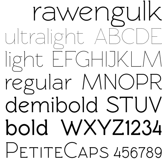
Rawengulk is another font you might want to use when designing, because it is under OpenFontLicense, is free and comes in many versions. Personally, I think the regular and demibold versions look great, but you might prefer the others too. You can use this font wherever you want to, even in blocks of text on a webpage, because it offers so much variety. Thanks to the many versions, there isn’t a product you wouldn’t be able to use this font on. You can see, preview and download Rawengulk from here.
After taking a look at several fonts you might want to use in the design process, I think now it’s the time to look at some you might want to avoid. Let me start with a very popular font, probably overused today, which I am sure many of you already hate the name and the look of: Comic Sans MS.
Although few years ago Comic Sans MS was a very popular font, the fact that today it is not favored anymore on the web is partly due to its recent overuse. Comic is not suitable for serious content or websites, so it would be inappropriate to use it on a corporation website. Unfortunately there are many bad examples out there. You don’t need a screenshot of it, do you?
Bradley Hand is actually a very nice font for desktop use, but it is very difficult to read when used in small sizes. Bradley Hand has also become overused in birthday greetings and invitations, and is nowadays assigned to personal matters. That is why you shouldn’t use it on the internet, especially not on a corporation or a serious website.
The last font I advise you not to use is Franklin Gothic. It does not only it give a very classical feeling, but it’s been used so much on the paper that it is not suitable for the web anymore. You can’t expect to draw the user’s attention on your website when you use this kind of font.
This was a list with fonts to use and avoid in design. Sure, if the Franklin Gothic style fits your website then you should go for it, but as a general rule, there are some fonts that simply just don’t fit on the internet anymore. On the other hand, more and more independent designers develop fonts which look very good, are under free license and are very suitable for internet use. Some of the ones presented above are developed by independent designers, and I am sure they will be very popular on the internet soon.
Which fonts do you use in your websites, brochures or magazines? Are there some fonts that you would avoid at all costs? What’s your opinion on the fonts presented above?



Anytime I can see and use new and clean fonts it’s a good day. I also loathe comic sans and fully support it being over used and misused. It had it’s day…let’s let it go.
incredidible computer and other digitalize art at graphic mania
wow!.people!contact graphic mania