Retro Typography: Trends and Showcase
5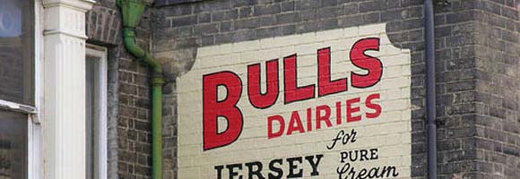
Memories and More…
There are many print ads that evoke memories of old when we see them, and bring to mind the happy or sad times, or any emotional feelings that resonate within. For the tugging of the heart strings or that “I remember!” moment, you can thank retro typography for taking you back to that special place.
What Does Retro Typography Do?
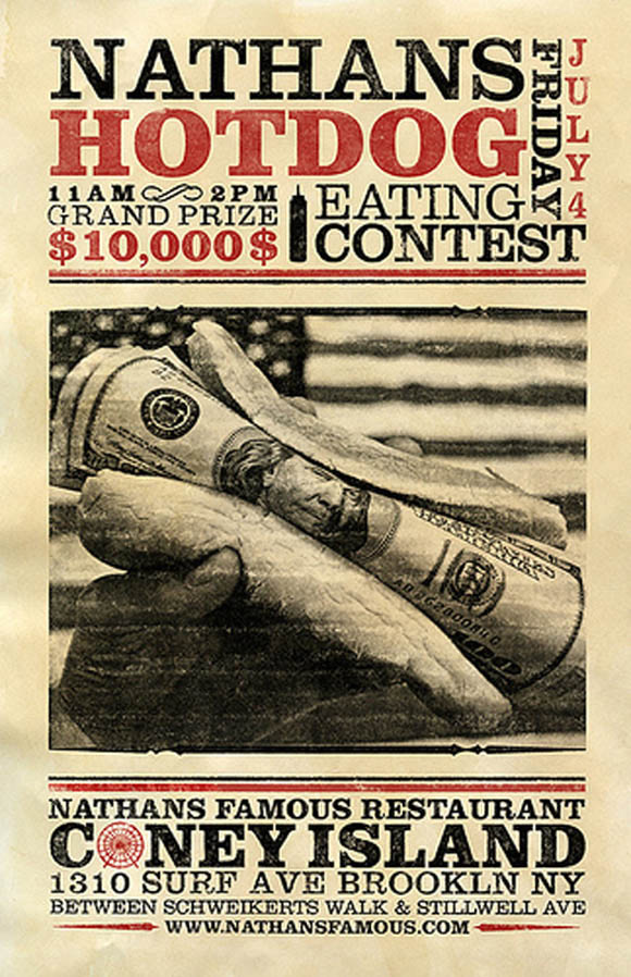
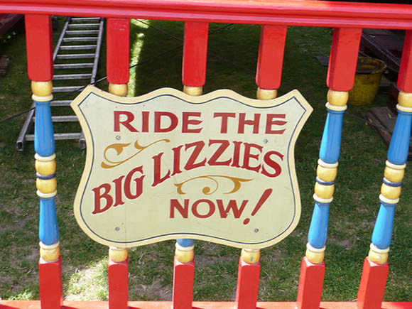
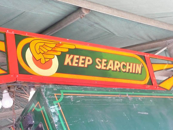
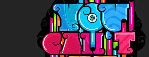
Retro typography seems to make things come alive, even though the visual aspect of it is clearly from another era. Graphic designers and illustrators use the retro typography tool to do more than make a piece look good. It gives it something like a vintage feel that helps the reader to connect to the work. The designer hopes to sufficiently create a nostalgic feeling in the reader. Here are a couple of examples:
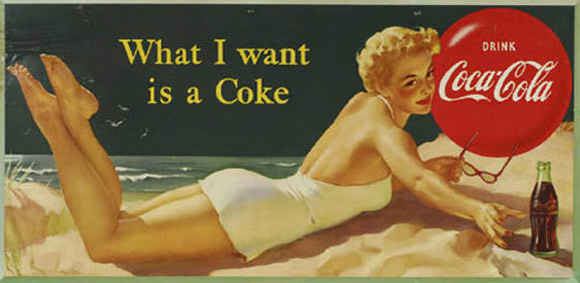
1. The typeset design of the Coca-Cola soft drink from 40 years ago versus the design from today is vastly different. The old typographic design makes you think of bottle cap openers, ice boxes (freezers) and easy summer days.
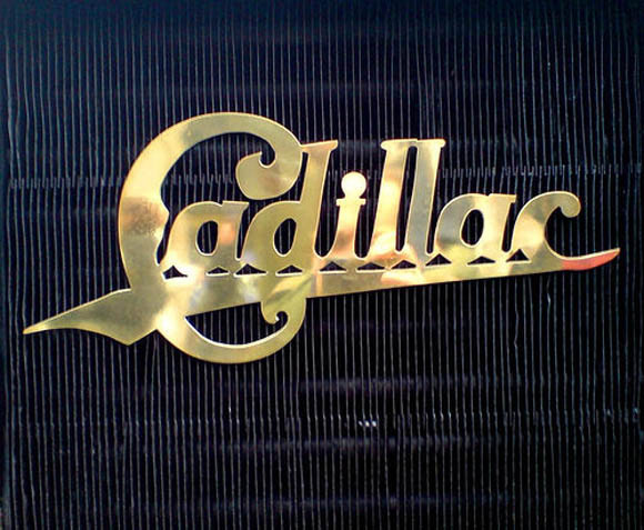
2. One of the oldest and most popular car manufacturers, Cadillac, features a retro typography ad that shows the maker’s name in thick, bold lettering with the bottom and sides of the letters kind of squished together. The “C” in the word has a flair curve underneath it, and when you look at the name, you think of the 70s, the time when Cadillacs had become very popular and were in their heyday.
3. Even print ads from the 40s and 50s will bring back those memories with the lettering that looked faded and spaced substantially apart. The letters looked like they were typed on an old typewriter or printed on carbon paper.
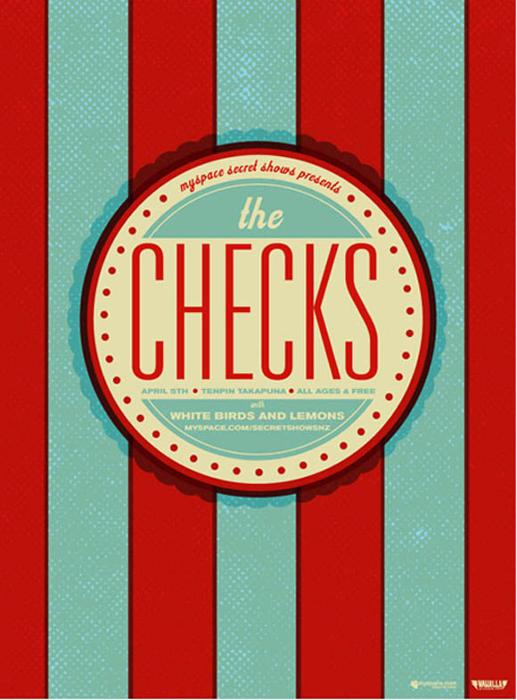
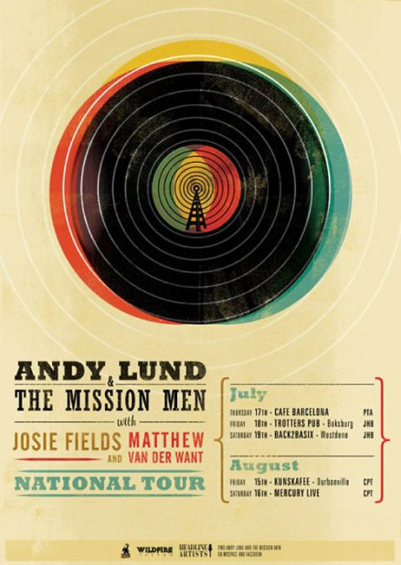
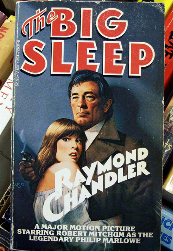
When a designer uses the retro typography tool, he’s going for that nostalgic, memorable look that will give the piece an “old” feel. There’s a lot of fun to be had with this style since there are so many ways to design around the typeface’s height, spacing, kerning, and word-wrapping.
-> Illustrators frequently use the typeset to “paint a picture” by making the reader feel as if they are in that era.
-> Graphic Designers carefully use coloring and spacing to make the piece look authentic.
Fitting the theme with the typeface are very important parts of making the retro typography look appear classic and genuine. For instance, fitting a magazine’s title and point size on the cover for that “Herald News” look requires that the creator use the right font, size, and letter spacing to make it really look newsy.
It’s also important to pay attention to the era of the retro style that you’re focusing on to make sure you get it right in the material. Of course, modernizing the retro look can be done, but for that authentic look, it’s better to go 100% retro in the entire design.
The retro photography style and application is a tool that will always be used and never gets boring with designers and illustrators. Those that have a good creative eye and know what fits will constantly use the tool to makecreative pieces.
Thanks Aimee Sway such a nice post
Nice post Aimee, great to know that the history of typography.
Very creative typography designs, thanks for share
Retro typography reminds me of the time when signs were hand-painted rather than just printed out in large numbers.
Amazing collection. I like typography and still find them useful. Thanks for sharing!