A Guide to Select a Font Family for Any Project
0I love playing with fonts. When I first started designing web pages I went a little crazy with the whole thing. I would change the font on every page, using some of the strangest or coolest I could find, and sometimes the color and typeface were virtually impossible to make out. Of course, this was back in the days of basic HTML, when you were more likely to see glittering graphics that turned every web page into a Myspace profile.

Now times have changed, trends are different, and of course I am older and wiser. I have learned – mainly through actually being an adult and not a glitter happy teen – that font is an important part of creating an overall look. You cannot just throw a typeface at every other word. You have to take the time to select what best works for what, find out how it looks on different browsers, follow recommended guidelines and keep the viewer in mind. Perhaps it is less fun on an experimental level, but more productive and leads to a final product that will be far more pleasing to the eyes.
Related posts:
- Best Usable Free Fonts of 2011
- Fun Helvetica Posters
- Free Fonts to Use in Your Design
- Nine Fonts to Use and Avoid in Design
Whether you are creating a personal page, a business site or working on a professional project, you can use this simple guide to help you find what works.
The Basics

Before you begin selecting which fonts you want to use, it is a good idea to keep a few things in mind, first.
First of all, the fewer fonts you use, the better. One will often suffice, but you should never use more than three or four in any project, as it will detract from the overall look of the design. It can also be distracting and hard for the viewer to read, as their mind continuously jolts to attempt to keep up with what their eyes are seeing. It isn’t a deal breaker, but it isn’t a pleasant feeling either.
Second, keep the same font throughout an entire sentence. If you have a specific reason for changing the font in the middle of a line then so be it. But otherwise you should refrain, and if you do plan on doing it you should question if it is really a good idea. Even changing the font in the middle of a paragraph can look tacky.
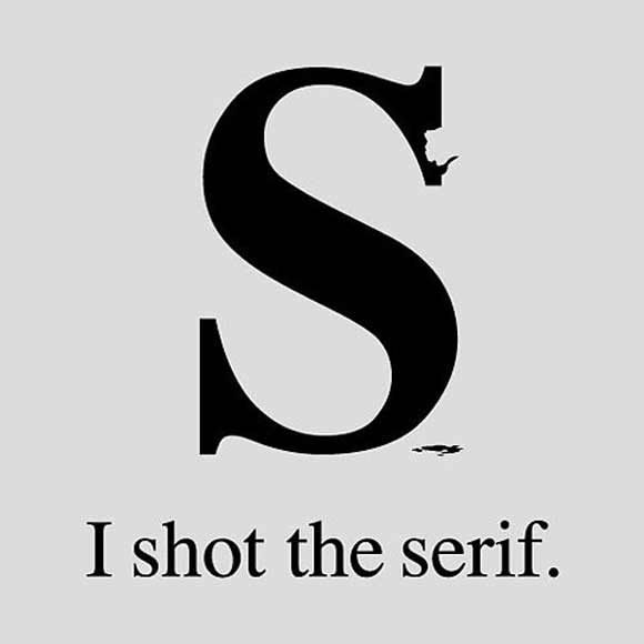
Third, there is a difference between online and printed work. If you are going for something posted only online, use sans serif. If it is print or will be printed, use Serif Standard. This is a basic rule that all publications follow.
Websites And Sans Serif Fonts

What is a sans-serif font? It is a typeface that doesn’t have those little hooks that are on the ends of words. It is often used for print, and there is a basic rule in print design classes usually explain the very first day: They are only used for writing headlines. That is why when reading a newspaper, you will see the hooks in the title but never the body, with two different styles of fonts used.
But there is one thing that is often ignored in those classes: the rule does not apply to websites. If the page is online you will want to use sans-serif as your basic typeface style. This is for obvious reasons; if you are working with paper it is a direct format and so without the resolution issues of the computer screen and web browser. The hooks on the ends of words might mesh together and make it difficult to read, or blur at the edges.
Luckily, there are several sans-serif fonts available, and most are probably typefaces you would have selected anyway. The most commonly used are Ariel, Calibri, Geneva, Helvetica, Verdana and Lucinda Sans.
Print Formats And Serif Fonts
As I said above, anything in print will use serif fonts except in headlines, such as in pamphlets, newspapers, magazines and other mediums. But keep in mind that also applies to printer friendly versions of your web page. This should preferably be separate from the actual page, with a link moving to a serif version of the same content, already formatted for efficient printing.
There are fewer serif fonts that are stylish and readable, but enough that it shouldn’t be too difficult to find one you like. A few are so popular you probably use them regularly in your work without even noticing, and you will almost always be seeing them when you read a traditional print item. Some of the most used serif fonts are Times New Roman, Garamond, New York and Times.
Other Tips
There are a few other rules that you should follow when it comes to using certain kinds of fonts.
Fantasy Scripts And Websites
One of the biggest mistake people make is using cursive or fantasy typefaces on web pages. Blogs like Livejournal made them a style option, and that was fine for personal use. But when writing something you expect others to read (including non-native English speakers), using them there is a big mistake. They are unclear, mesh together, don’t work well with screen resolution and don’t have the character choices of other fonts.
Small accents and embellishments using these are fine, as are headlines, captions or other rare parts around the site itself. But the bulk of your text should always be in sans-serif, or sans for printing as stated before.
Both cursive and fantasy fonts are easy to come by, and most document programs have them. Comic Sans MS is a good example, as are Lucinda Handwriting, Impact, Kino and Zapf. Of course you also have symbol fonts, which can be used on webpages for effect. But be sure you only use the clearest available.
People usually think of typewriters when they hear monospace, which is understandable. It is a retro style where each character is the exact same width apart. But it is fantastic for coding, and so it can be easily incorporated into web design.
You can find many different fonts for this purpose. But the most popular are probably Courier New, Lucinda Console and Monaco. These are also interesting effects fonts, which can be used to convey coding in a design.
Monospace and Coding
This guide should give you a basic understanding of the importance of fonts and how you can use them properly in your design. If you are mindful of your choices you will be able to nail the look of the finished product.