6 Web Design Trends Ecommerce Stores Will Follow in 2016
0You all know ecommerce has turned into something unprecedentedly big, but how big actually? Well, the answer to this simple question is least likely to be simple, considering all the variables and uncertainties involved.
However, internet Retailer still tried to dig deep into this and came up with an astonishingly huge number, i.e. somewhere between 12-24 million ecommerce sites populate the web world. RJMetrics revealed another interesting fact about ecommerce sites; they constitute about 11% of the top 1 million websites based on Alexa ranking system.
This means one thing for sure, ecommerce industry is going great and you can definitely get your gig if you play your cards wisely here. But the problem is that finding your way up through this immense competition prevailing in virtual world is not that easy.
For instance, according to Online Marketing Institute, 85% of visitors on a website abandon it right away if they are not happy with the design, 62% navigate away if they aren’t able to access easily what they are looking for, and 83% abandon a site when it takes lot of clicks to get through simpler jobs.
The good news is that if you are able to address the concerns of your audiences rightly, rewards are just unbelievable. And to help you put up something significant in the name of an ecommerce store; I am here with these 6 ecommerce design trends to stay relevant in 2016.
1. Parallax Effect
Surfaced around 2011 in web design realm and brought to fame in 2013 by Apple, the Parallax effect is going strong in 2016 and for good reasons.
It’s a technique used to offer a horizontal or vertical motion to website layers at varying paces, which results in simulating a ‘faux 3D effect’, creating a sense of depth to design element of a web page. This not only adds to the visual appeal of a webpage, but also improves its functionality.
Major Benefits
- Allows you to present your products in ‘3D’ to your consumers, offering a 360-degree view of a product, empowering customers to take charge of how they want to see their desired item.
- You can offer site visitors a totally dynamic experience with moveable layers of parallax effect without compromising the usability of your e-store.
- This technique can also be used to prompt visitors interestingly and convincingly to follow your calls to action (CTAs).
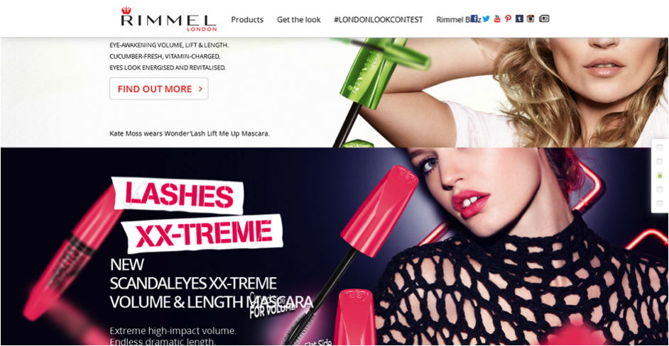
You need to check Rimmel London US to get mesmerized by how captivating parallax effects can be when applied efficiently to a webpage.
2. Lazy Loading
This design technique is also expected to gain some momentum through 2016. Lazy loading is all about rendering on-screen UI elements only after a visitor accesses them while scrolling, thus significantly reducing the time it takes to load a complete page instead.
What’s it good for? It’s good for taking better care of those 55% of visitors who turn away from a page in under 15 seconds on average, according to this report on HubSpot.
Major Benefits
- A webpage is loaded in sections with ‘Lazy Loading’ based upon the scrolled area, which could get your consumers directly to their desired product much faster.
- Faster page loading can dramatically improve the customer retention rate of your e-store.
- Google also likes faster page loading.
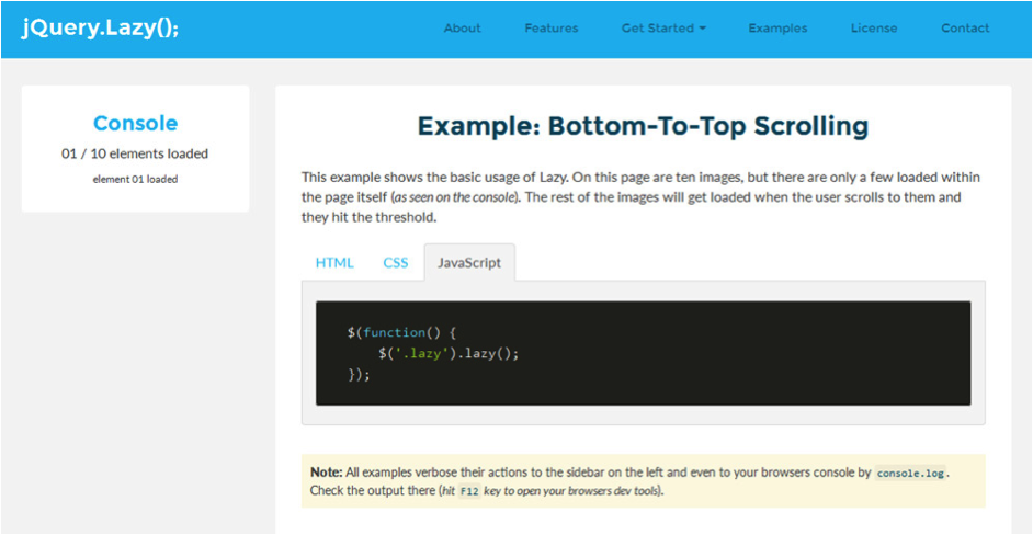
jQuery Lazy can give you a better idea about how to ramp up the ecommerce experience of your customers using lazy loading technique.
3. Flat Design
Ever heard of “less is more”? Be prepared to hear more of it throughout 2016, as flat design becomes one of the major design features this year. This technique serves best if you are determined to have a clutter-free and user friendly ecommerce store.
Instead of stylistic elements (drop shadows, gradients, bevels, etc), this technique makes use of grids, white space and bold colors along with large CTAs, typography, iconography and sans serif.
Major Benefits
- This design technique is aimed at bringing products on your store to the forefront by virtue of its intrinsic clarity and simplicity. Absence of stylistic enhancements means visitors will not get much of distractions and stay focused on the merchandise at offer.
- In addition to visual clarity, simple interface serves well in cross-browser compatibility and mobile device scalability.
- No stylistic elements also contribute in making a webpage lightweight and fast to download, which means higher SERP rankings by search engines.
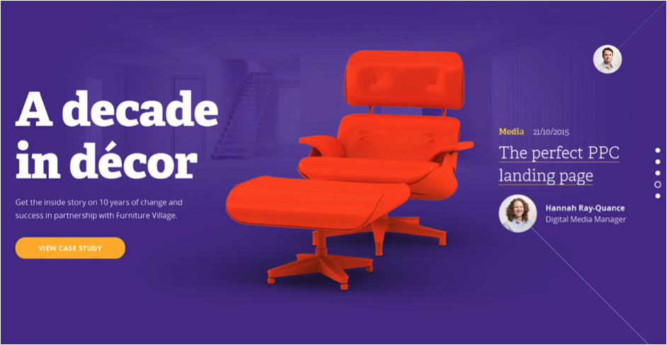
true. is all about how enchanting flat design can be.
4. Split Screens
There is another design element you would get more of all through 2016, i.e. split screens. This technique is especially useful if you have two items that you want to give prominence simultaneously.
In fact, you better not confine the use of split screens to displaying two equally important items simultaneously; they can be used for other purposes as well. With split screens implemented, you might prominently display your main product on one screen, while reserving the other to showcase some other info about it, such as high quality images, manufacturer’s information or something else.
Major Benefits
- You can display more than one item simultaneously without cluttering the layout of the page
- You can give your users some additional essential info about the main item on display
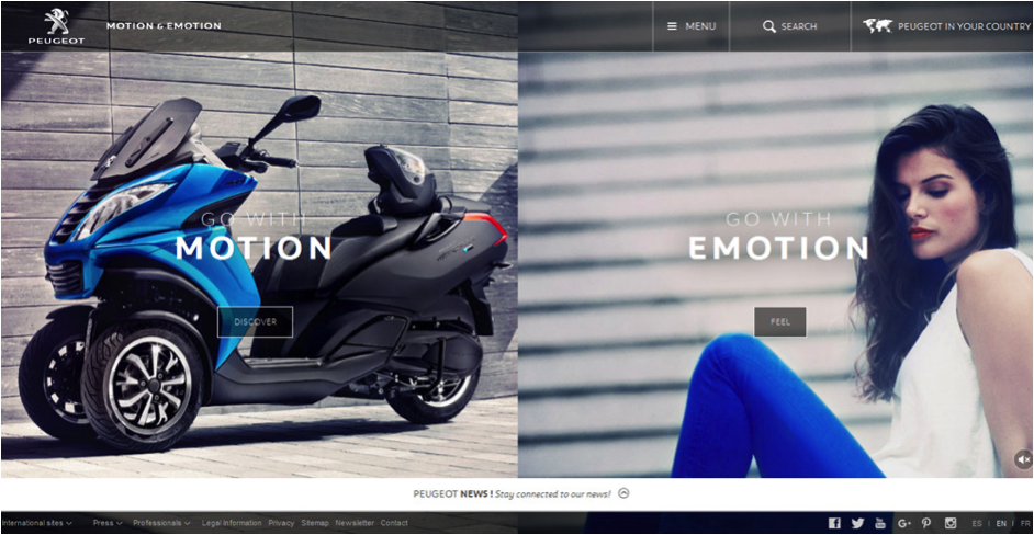
To get a better idea of potential split screens hold in making your customers happy and satisfied, take a ride with PEUGEOT.
5. Hover Effects
Talking of keeping a webpage neat, clean and tidy, I couldn’t have left out “Hover Effects”, not because I like it (which I do!), but because you will see more of these in 2016.
It is basically a CSS-based technique devised to alter an element on a webpage or some of its attributes (size, shape, color, etc) only after a visitor accesses it with a mouse arrow.
You can use this technique to keep layout of a page cleaner by displaying some UI elements only when an element on a page is accessed, which contributes in enhancing the usability of an ecommerce store noticeably.
Major Benefits
- Hover effects make it easy for you to keep your store layout neat, clean and tidy.
- Changing various elements on a webpage (or certain attributes in them) enables you to highlight a specific area on the page.
- It helps enhance usability of a page as well.
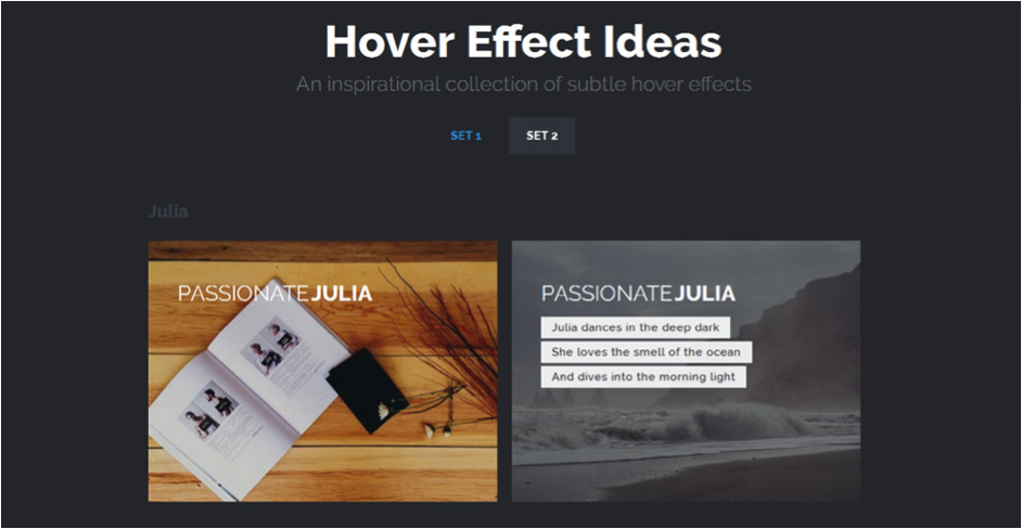
Check Hover Effect Ideas to experience the charm of hover effects.
6. White Space
It’s all but natural for online shoppers to prefer stores having simple, easily accessible and navigable layouts than intricate designs. That’s why the use of white space as an essential element of web design for ecommerce stores during 2016 makes perfect sense.
Sometimes also known as “negative space”, this white space refers to the area left blank amongst the graphic elements on a webpage. Another important thing to know is that despite being called “white space”, you can use any other color to fill this space.
Major Benefits
- White space enables you to organize products or some other forms of content distinctively, resulting in a user-friendly presentation of products for viewers.
- It also helps viewers zoom in on the hotspots on a webpage, particularly promos, call to actions statements and other offerings.
- With ample white space on a webpage, visitors are able to navigate through your store with ease, thus finding their desired items quickly, which is one of the most reliable ways of retaining your customers.
Beatbox Academy introduces you rightly to the richness and life “white space” adds to a webpage.
What’s Your Take on This?
Though you can never confine something as imaginative and diverse as web design to a few elements, but these are the ecommerce design trends expected to be the order-of-the-day in 2016.
So, which ones do you find most irresistible to try on to your ecommerce store this year? Let us know about your preferences in the comment section below, just as any other of your observations, opinions and experiences in this regard.