50 awesome colourful logos
3As you are almost certainly aware of, a logo is one of the most important pieces of a company’s brand. When a logo needs to be designed, you need a variety of input: the company’s expected target market, a style guide if present, your client’s preferences and expectations, and more. The most important thing to have is inspiration!
In the past we’ve written about how to use negative space in logos, showed some nice skull logos, listed light bulb logos and apple logos, and showed some very creative typographic logos. Last year we said that too many colours should be avoided and that the shape of a logo is the most important. Is that really the case though?
When a logo is too colourful and detailed it may be difficult to print or resize to small formats. However, for many companies that only operate in the digital world these considerations do not apply. The amount of detail and colours to use in the logo should be decided based on which media and in what sizes the logo will be used.
Colourful logos are loosely defined by us as having 3 different colours or more, and usually many gradients between the colours. These kinds of logos have seen a tremendous rise in the past years. More and more of them are appearing, with some very nice ones in there. In this post we list a couple of our recent favourites along with why we think they are good.
Name: CreaSoul (View at LogoFaves)
Why we like it: This is one of our favorites. Subtle colours, creative and dynamic water-like shape, very nice type.
 Name: Cancer Therapies Foundation (View at LogoFaves)
Why we like it: nice alignment of cancer awareness ribbons creating an interesting shape.
Name: 125 colors (View at LogoFaves)
Why we like it: unusual palette and shapes create a dynamic feel.
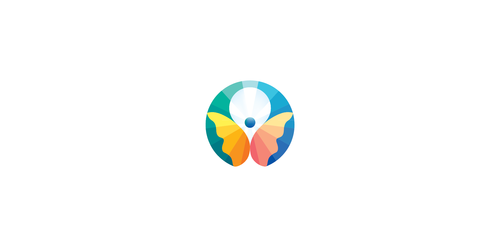
Name: Tutti i fiori (View at LogoFaves)
Why we like it: soft pastels work well, butterfly escaping the shape.
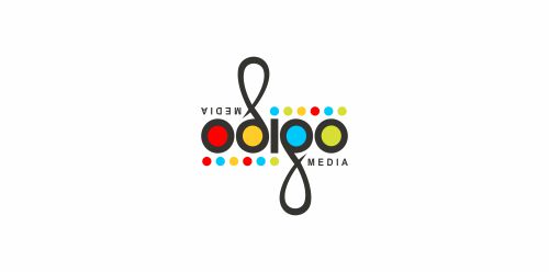
Name: odigo (View at LogoMoose)
Why we like it: the only ambigram (shape can be flipped) in the list, very bold and distinctive logo.
 Name: Health Center (View at LogoMoose)
Why we like it: understated colours, no straight lines.
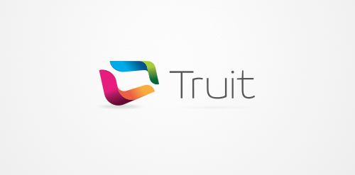
Name: Truit (View at LogoMoose)
Why we like it: shape has a real feeling of depth, colours and type are great.
![]()
Name: du oil (View at LogoMoose)
Why we like it: colours flow into each other nicely.
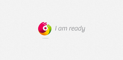
Name: I am ready (View at LogoMoose)
Why we like it: interesting visual.
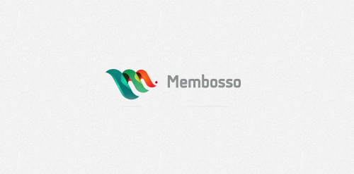
Name: Membosso (View at LogoMoose)
Why we like it: unusual colour combination, shape clearly tied to company name.
Name: Red Heidy (View at LogoMoose)
Why we like it: no mistaking the shape, very bold colours.
Name: Apelsyn (View at LogoMoose)
Why we like it: shape is very recognizable, and because of the negative space inside it very memorable as well.
Name: Chromatistes Meres (View at LogoMoose)
Why we like it: real eye-catcher, and the choice for a multi-coloured logo matches the company name well.
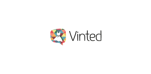
Name: Vinted (View at LogoMoose)
Why we like it: Vintage colour, a speech bubble and the dress represent all that Vinted is about: a community to trade clothing.
![]()
Name: Global Voyages (View at LogoMoose)
Why we like it: bold colours, we feel the “V” is slightly less readable though
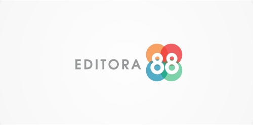
Name: Editora 88 (View at LogoMoose)
Why we like it: at first glance a simple composition but the coloured shapes match the two 8’s well.
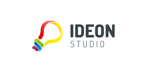
Name: Ideon studio (View at LogoMoose)
Why we like it: very bold colours that delineate a clear shape.
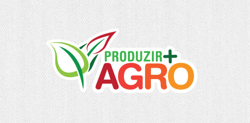
Name: Produzir Agro (View at LogoMoose)
Why we like it: subject matter is represented well by the chosen colours and shape. Palette also used on the words.
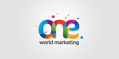
Name: One World Marketing (View at LogoMoose)
Why we like it: set of colours that is not often seen together.
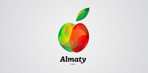
Name: Almaty (View at LogoMoose)
Why we like it: Colours match the apple shape while the different tones make the visual interesting.
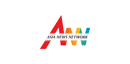
Name: Asia News Network (View at LogoMoose)
Why we like it: it’s a little busy on the eyes but the alignment of the company name inside the image is something that is not often seen.
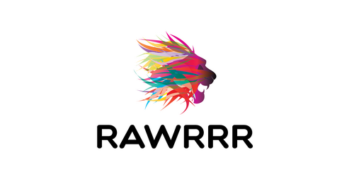
Name: Rawrrr (View at LogoMoose)
Why we like it: we’ve never seen a lion with a more original colour palette.
Name: app (View at LogoFaves)
Why we like it: at first glance it’s a simple fish shape but look again and you see many nice details.
Name: NorthColour (View at LogoFaves)
Why we like it: Northern lights in a subtle logo but still having lots of colour.
Name: African Film Club (View at LogoFaves)
Why we like it: very unique feel to the logo, type matches logo well.
Name: brand your genius (View at LogoFaves)
Why we like it: we added this one because of the cool artwork, we’re not completely sure how it would function in different formats and on different media.
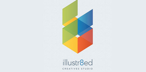
Name: illustr8ed (View at LogoFaves)
Why we like it: unique shape, image is very bold even though the colours are not fully saturated.
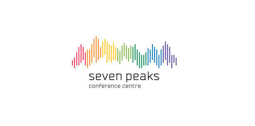
Name: seven peaks (View at LogoFaves)
Why we like it: colourful representation of the company’s name.
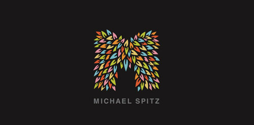
Name: Michael Spitz (View at LogoFaves)
Why we like it: lots of detail, nice composition.
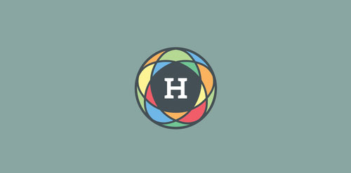
Name: HCHC (View at LogoFaves)
Why we like it: toned down colours are unusual for these kinds of logos, they work well.
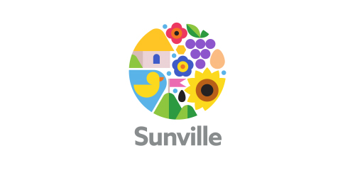
Name: Sunville (View at LogoMoose)
Why we like it: beautiful arrangement, very bright.
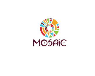
Name: Mosaic (View at LogoPond)
Why we like it: coloured segments are pieces together in a fitting mosaic.
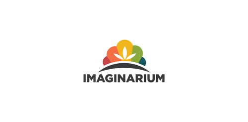 Name: Imaginarium (View at LogoMoose)
Why we like it: another example of multiple pastels working well together.
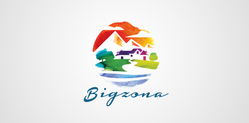
Name: Bigzona (View at LogoMoose)
Why we like it: very detailed, looks like a watercoloured painting.
 Name: in the city entertainment (View at LogoFaves)
Why we like it: a combination of skypscrapers and film rolls represents the brand well.
Name: Message! In a bottle (View at LogoFaves)
Why we like it: multi-coloured but minimalistic logo, which is less often seen.
Name: BeachPark (View at LogoFaves)
Why we like it: tubes express playfulness well.
Name: Analog 2 (View at The Design Inspiration)
Why we like it: this is the sort of logo that was often seen at the beginning of the multi-coloured logo trend: very bold colours arranged in a circular shape.
Name: Rio2016 (View at LogoFaves)
Why we like it: pleasing to the eye, symbolism of people holding hands.
Name: Guanacos (View at LogoFaves)
Why we like it: unique colours and original alignment to the right.
Name: Bigcolors (View at LogoFaves)
Why we like it: recognizable, colourful but predominantly black, bold logo.
Name: Kidtech (View at LogoMoose)
Why we like it: double (triple) rings with well-matching colours.
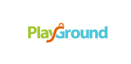
Name: Playground (View at LogoFaves)
Why we like it: although it has three different colours and the slide overlapping the type, the logo is not busy at all.
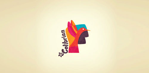
Name: Colibrian (View at LogoFaves)
Why we like it: colours like the Guanacos logo above, playful type (though difficult to read).
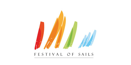
Name: Festival of sails (View at LogoFaves)
Why we like it: excellent way of conveying the message with just a few very well executed strokes
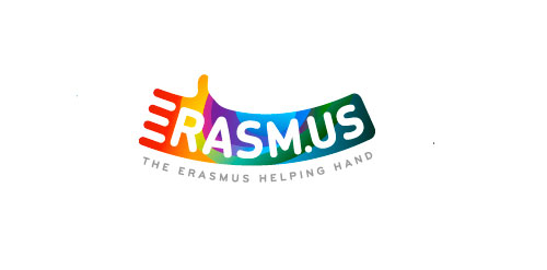
Name: Erasm.us (View at LogoFaves)
Why we like it: the only one so far where the entire company name is enveloped by colour.
Name: Prime Childcare (View at LogoMoose)
Why we like it: shape overlaps itself with well-matching colours, difficult to achieve well with so many colours. Shape is recognizable and clearly related to company name.
Name: Coloro (View at LogoMoose)
Why we like it: interesting palette and shape.
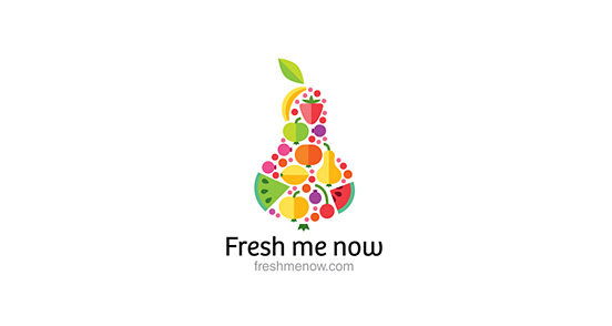
Name: Fresh me now (View at The Design Inspiration)
Why we like it: a piece of fruit made up of multi-coloured pieces of fruit, what’s not to like?
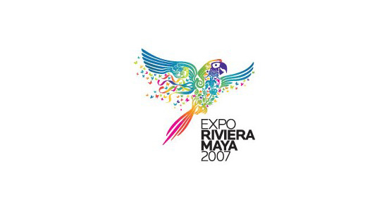
Name: Expo Riviera Maya 2007 (View at The Design Inspiration)
Why we like it: pretty colours, nice details and still a recognizable shape
We’ve seen multi-coloured logos in pastels, understated primary colours and in-your-face bold colours. Abstract shapes and real-life shapes were both common. Which one is your favourite?

[…] I’m looking to finalize a logo for my design house in class, I came across this post over on Graphic Mania That really gives inspiration on not only colorful logos, but also logos that […]
[…] The original post can be found here: 50 awesome colourful logos […]
Wow! Beautiful selection of excellent logo designs, and I love how colourful they are! Thanks for sharing this, I am inspired;)