How to pick a colour palette from an image: 7 web-based tools and how to use them
0Finding the right colour palette for a design project can make or break the website or blog you are designing. One of the most fun ways to find a new palette starts by browsing images and photographs for inspiration. When you find an image with a colour scheme that you think may work for your website, you can get suggestions for a colour palette based on that image by using a number of tools. Below we have listed some of the best ones, including how to use them.
See also these blog posts that may serve as a starting point for finding fitting images:
28 Clean and minimal photography examples
Stunning examples of light painting photography
Astonishing examples of flare photograpy
40 Nice colorful abstract backgrounds and tutorials round-up
25 Extraordinarily examples of toy photography
Amazing reflection photography examples
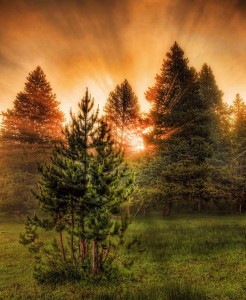
In the examples below, I will use the following image. It has a striking set of different colours that appear to work very well together.
Kuler
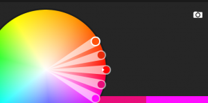
The first tool I’ll demonstrate is Kuler, from Adobe. By now it’s one of the best known colour scheme tools and with good reason as it provides many good features. Currently we will only be looking at the feature for retrieving a color palette from a photograph. This process starts in Kuler by pressing the (easy to miss) camera icon located in the top right.
A file browser will immediately open after clicking the camera icon. Select the image you want a palette from and open it. After doing that, Kuler will display a result like below.
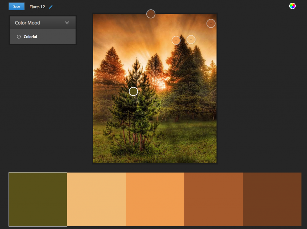
As can be seen from the example, the palette suggested by Kuler has some nice matching colour in earth tones. The thing I like best about Kuler’s palette generator though, is that you can adjust the colours picked by Kuler by dragging around the circles (which are colour pickers, or eyedroppers) in the image above the suggested colour palette. Simply click the colour you want to adjust. The colour picker inside the image will get a bright white border around it (located on the tree in the example above) and you can drag it around to make adjustments. Again, in my opinion the palette suggested by Kuler is already pretty good!
PHOTOCOPA
ColourLovers, a community for people who love colour, have a tool called PHOTOCOPA to generate palettes from images. To use this tool with a picture you’ve chosen yourself, you need to register with or log into ColourLovers first. This can be done through the ‘sign up’ and ‘log in’ buttons in the top right of the page.
To work with your own image, it needs to have a URL. So far I’ve not seen a way to upload your own image in PHOTOCOPA, so if you only have the image on your computer you should upload it somewhere first.
By default the “Colors” tab is selected. Grabbing a palette through PHOTOCOPA starts by going to the “Photos” tab.
After that, you will see the following:
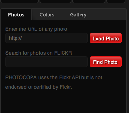
In the URL field, enter the URL of the image that you want to process and click the “Load Photo” button. You will get a warning saying your current colour scheme will be lost if you continue. Press “OK” if you haven’t done anything that needs to be saved and the result will look like below.
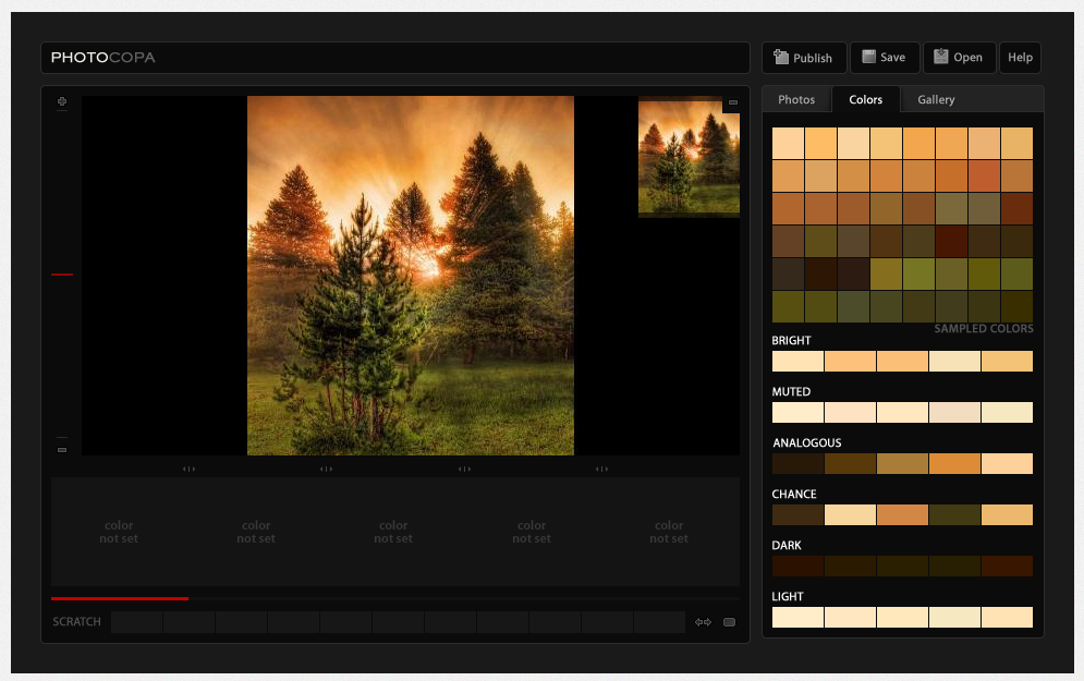
As can be seen PHOTOCOPA retrieves a number of palettes from the image, as well as a grid showing all sampled colors.
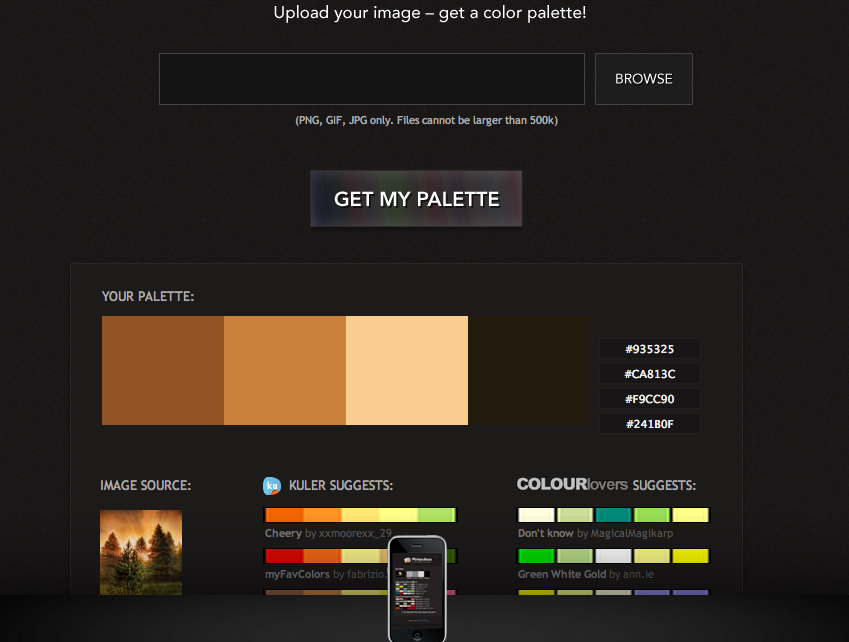
Pictaculous
MailChimp have made a utility called Pictaculous whose only purpose is to get a colour palette from an image. The way it works is easy: press the “browse” button, select your file, and press the “GET MY PALETTE” button. In the example below you can see the palette suggestion based on our example.
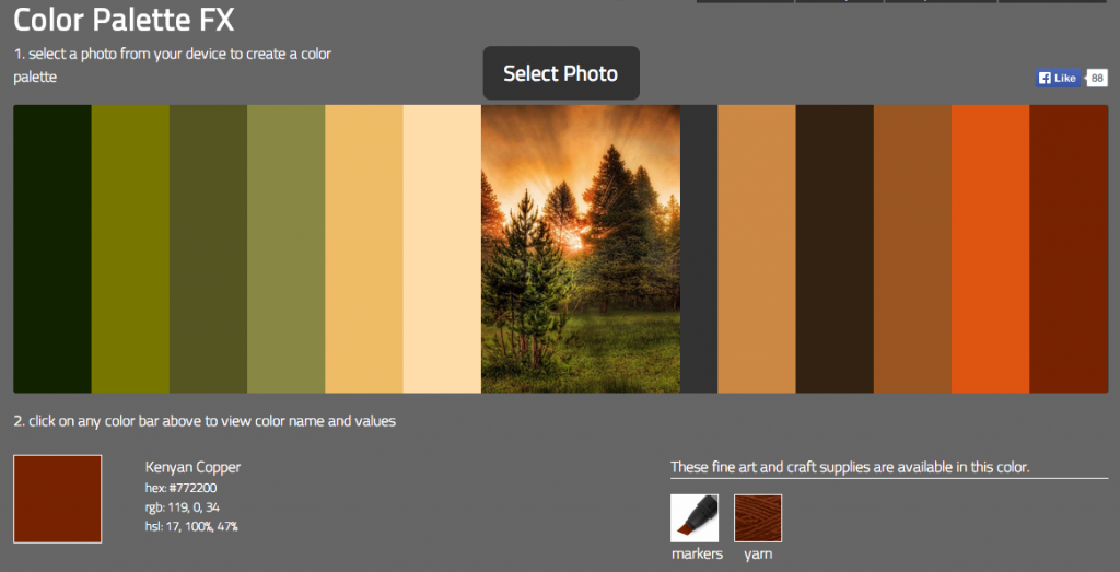
Color Palette FX
Color Palette FX is also very straight-forward. Press the “Select Photo” button, select the image file you want to use and it will immediately be processed. The result looks like below. What I like is that it displays a wide range of colours from the image and that each of the colours is also named: in the example below the last colour of the swatch below is called Kenyan Copper for instance.
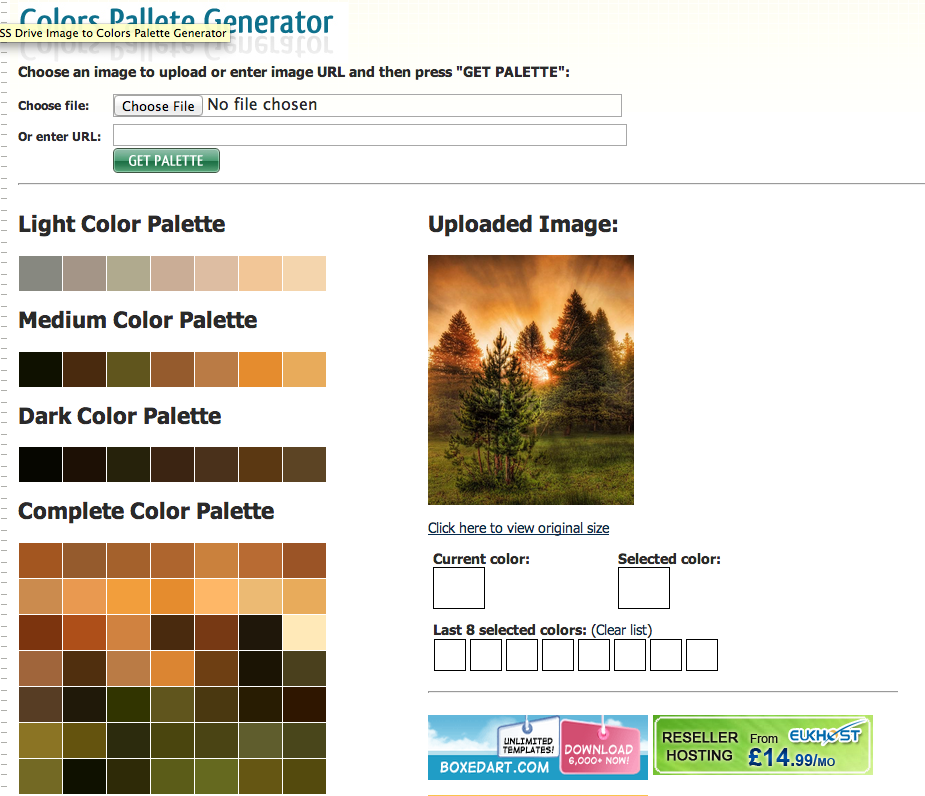
ImagePalette
CSS Drive has a palette generator called Colors Pallete Generator. To process your image, press the “Choose File” button, select your image and press the “GET PALETTE” button. The result will look like below. Like ColourLovers, it gives a couple of different palettes and a grid with sampled colours from the image.
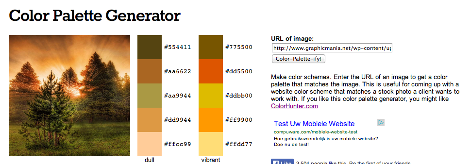
Color Palette Generator
The Color Palette Generator by DeGraeve only works with image URL’s. Like with PHOTOCOPA, if you only have your image on your computer you should upload your image somewhere to get a URL. After supplying a URL and pressing the “Color-Palette-ify!”, the result will look like below. Instead of a dark-medium-light distinction, this palette generator gives a ‘dull’ and ‘vibrant’ palette which leads to interesting results. In my example the palettes suggested do not contain colours that match well in my opinion, but results may vary for you.
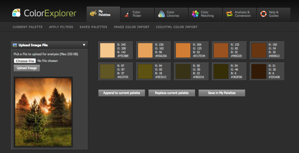
ColorExplorer
ColorExplorer’s palette grabber can be found by pressing the “Image color import” menu option in the horizontal bar below the large menu that starts with “My Palettes”. After going to the image color importer, in the left column press the “Choose file” button, select your file and press “Upload Image”. You will see the image you uploaded in the left column and the resulting palette in the main content section. Below your image in the left column you can also set how ColorExplorer should analyze your image’s colours, from Rough to Ultra Fine, which is an interesting feature. Setting it to Rough results in a palette where the suggested colours are further apart.
As you have seen the results for each tool can vary greatly! Because the utilities mentioned above can give fairly different results I recommend to check at least a couple for any image you’ve chosen. The palettes generated by each of the tools should be seen as a starting point. Combining the suggestions by these tools with your own insights gets you the best results!