10 Interesting Typography Compositions
1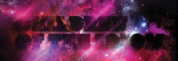
Usually, typography concentrates on what font you use and how you decorate the font. But there is another important side to typography – the composition. This is the arrangement of everything in a way that brings all the elements together. Here are some interesting examples of typography composition.
Related posts:
- A Journey to the Arabian Nights with Julian Breton’s Calligraphy
- 20 Stunning Typography Examples
- Free Tools to Search and Identify A Font
- 10 Useful Examples of Script Fonts
1. “Black” by Islam Zayed
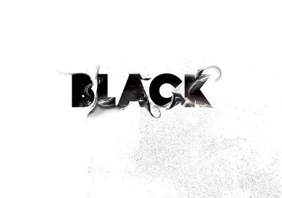
Zayed’s typography is stunning and inspirational. Not only does it play off being black and white, it has an aura of mystery with swirling smoke and splattered ink. Bold and beautiful.
2. “Chumbitos” by Anderson Maschio
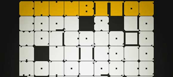
Maschio used only three colors in Chumbitos: energetic yellow, empty white, and quiet black. His choice of colors gives this work a lively but cold feel. The font is wide and square, giving it an almost brick-wall feel.
3. “Ran Out of Ideas, Now What?” by Yulia Brodskaya
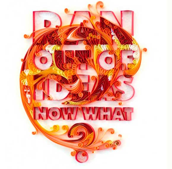
Brodskaya’s work is amazingly intricate and playful. She uses smooth curved designs to draw in your eyes. This particular work of hers features a red, orange, and yellow phoenix cleverly blended into the type.
4. “Narani” by Narani Kannan
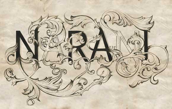
What better way to advertise your baeautiful typography composition than with your name as the typography. Inspired by classic Victorian ornaments, the work has a curling leaf designs. The designer left two of the letters in her name empty, giving it balance.
5. “Children of the Idiom” by Pablo Alfieri
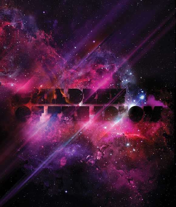
This typography composition is a spectacular display of color and light combined with an ominous dark feeling. Alfieri does amazing typography, usually with a space or star theme.
6. “Plastic Illusions” by Stefan Chinof
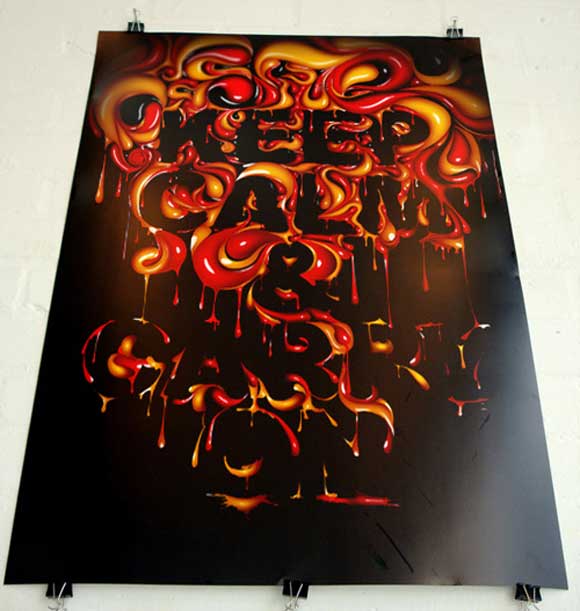
Chinof’s bubbling typography has a lot of personality. The swirls of red and orange combine beautifully with the black background. It gives this piece of art a dark feeling of dread, which is a great mix with the words, “Don’t Panic.”
7. “Static Typography Composition” by Sarah Hillebrand

This is a perfect example of using white space in typography to focus your viewer’s eyes. The colors are simple, using only red, black, and white. It makes an amazing and intriguing image.
8. “The Omnivore’s Delight” by Craig Ward
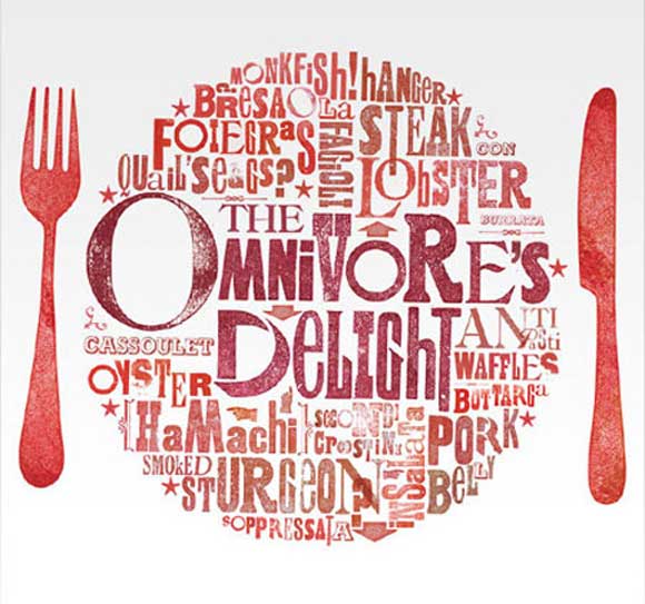
This is an interesting work of composition that uses only shades of red and white to make a plate of food with silverware next to it. Ward’s details are complex, but as a whole, it comes across as a plate.
9. “Don’t Let Money Change Ya” by Daniel P. Johnston
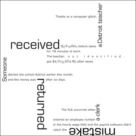
This typography composition is very complicated, too, running lines of text in every direction and at multiple angles. Alone, the words aren’t very interesting, but Johnston used typography to make them exciting.
10. “Ice” Berg by Sanyo

Composition meets the advertising world. This poster is an advertisement for an underwater camera, but the cleaver placement of the typography makes it very memorable. The word “ice” is above the surface of the water, while “berg” is just below.
If you are starting to think that your typography is getting too boring, there are infinite ways to make it more interesting. Using new colors, shapes, angles, cropping, and fonts can make any subject into an interesting piece of art.


[…] Found at http://www.graphicmania.net/10-interesting-typography-compositions/ […]