Fonts You Do Not Want to Use!!
7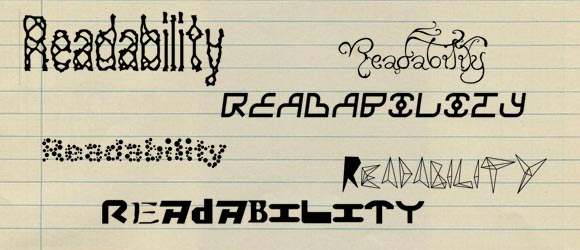
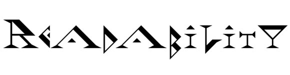
My intentions are not to offend any of the font designers, but sometimes a font design goes to far from the main purpose of the original font design and usage of the font. The main purpose of using a font is to deliver text content to the user with maximum readability. The font of any design is one of the main and critical units that is related to the most important part of the design, which is the content of the design.
Before continuing reading this post did you already join our Twitter and subscribe to our RSS feed? If not, rush and join us now to receive updates of new posts and free resources.
When you choose the fonts for your design or website, you have to consider some important facts to help provide user friendly designs and content. Here are some tips to consider when choosing the right fonts for your design.
Readability
Simplicity
This rule always aims to create readable content by providing simple font designs and structure. Complex fonts are hard-to-read and tend to confuse the reader while hampering the user from being able to read the content easily. The font should be simple and should not include a lot of detail and decorations, unless your main aim is in not being able to read the content. Besides choosing the font style, it is also important to keep the number of fonts used in the design limited along with limiting the colors of the fonts as well.
Contrast
Along with choosing the font type, the contrast between the font and the background used should be taken into consideration to ensure that the entire view is easy on the eyes of the intended audience. If the font color is not contrasted with the content, the users will be easily confuses and they will not be able to read the content very well. It is always recommended to have the text in black and the background in white, which provides the maximum value of contrast. This does not mean that you have to limit yourself to just these two colors for the text and background; you just need to make sure that you are providing a good contrast for the font display.
Styling
While simple fonts are better than complex fonts, by using font styling you can provide better recognition for the content structure. For example, using bold text for important words, and separating the text into multiple paragraphs to avoid content overlapping.
Also the content styling sends the message better for the user, kind of like writing in all uppercase letter text which gives the impression of shouting to the audience. However you have to be careful when you apply text styling so you do not send the wrong message to the audience.
Unity
When you choose a font you have to choose the one that will unify the overall general design or website. For example, when you choose a font for a business site the text should be simple and formal; and when you choose the font for a children’s website the font should be attractive to kids and not be a formal font. Font colors play an important role when it comes to achieving this unification, by using the font colors that are appealing and contrast with the design’s colors scheme.
Target audience
The target audience is also an important factor when choosing your font. Users are different in their interests and their visual capabilities. When you address your content towards the young audiences you have to choose an appropriate font size that is big enough help their young eyes adjust to taking in the information easily. On the other hand, business people would like to have a lot of information so you will need to use a smaller font while being careful and more selective with the number of colors and styles used.
Along with these tips, I would like to share with you some of the fonts that show different designs and styles; you can check out these fonts and see how they apply with the above tips and to see if you could possibly use them in your design or website.


Good Work Rafiq ;))
[…] Fonts You Do Not Want to Use!! | Flash, Design, Vector, Photoshop … […]
Social comments and analytics for this post…
This post was mentioned on Facebook by Rafiq Elmansy: #Fonts You Do Not Want to Use!! http://goo.gl/fb/lX6d #articles #photoshop #fontstips #freefonts…
[…] Fonts You Do Not Want to Use!! Submitted by graphicmania […]
hey can some1 help plz 2 find an arabic font named el 5at el sounbolly
thanxxxx alot 🙂