Creating a 3D Textured Environment in Photoshop
2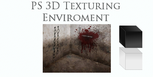
Despite photoshop 3D capabilities being rather limited, we can create an illusion of 3D space to make our artwork more realistic. For our 3D space we will need some good textures to use.
Can be one or two but not more than two, for better content fitting I would suggest to use one.
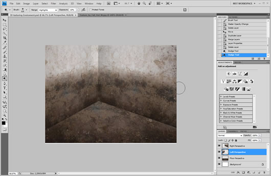
Creating a new document we will copy and paste the texture we want to use. On the layers panel we will double click the text name and we will name this layer “Left Perspective”
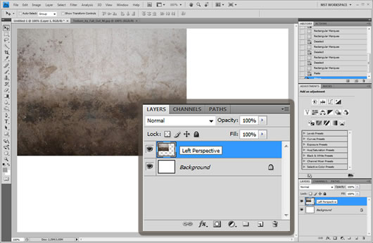
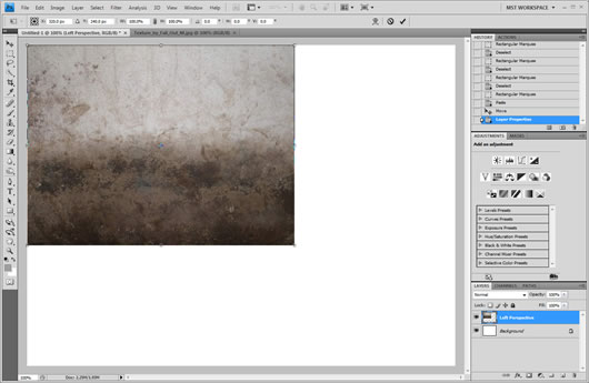
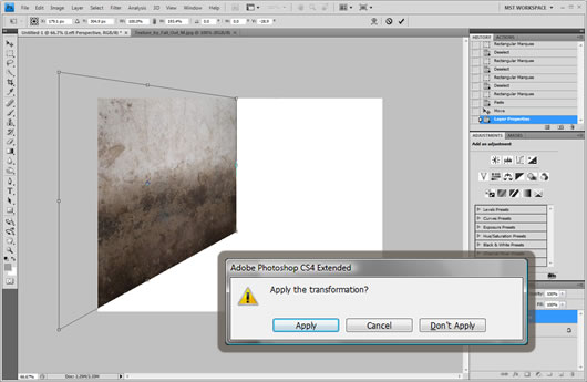
After we have named the texture, we will go ahead and click Edit -> Transform -> Skew
A box with 8 squares will encircle the image, it is the perspectives editor. Zooming slightly out we will drag downwards the low left corner and slightly upwards the upper left corner like shown in the image
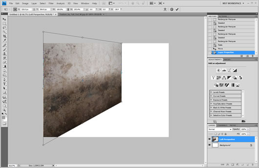
Then we will move the image in about the center of the document. We will click outside of the image and a message will pop up to confirm the transformation, we will click apply.
Then we will create a duplicate of the layer by clicking Layer -> Duplicate Layer. We will name this duplicate layer Right Perspective.

After we have created the duplicate layer we will click Edit -> Transform -> Flip horizontal, and we will place the layer right next to the left perspective layer. After that we will press twice the left arrow so that the overall image will look less like a pattern
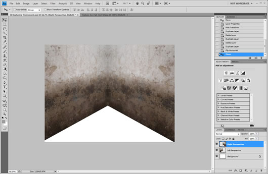
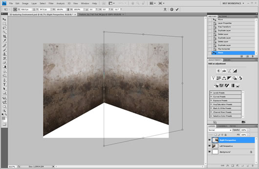
Then we will again click Edit -> Transform -> Skew. We will drag the upper right square just a little bit downwards, and the down right square upwards until the corner radius between the images is just a little bit less than 120 degrees.
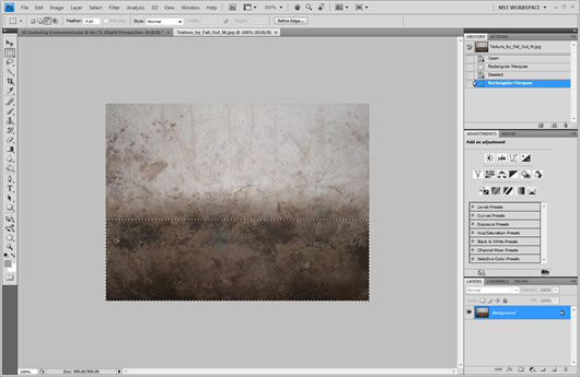
For the floor part we will copy only the very half down part of the texture.
We will upscale it a bit so as to make sure it covers all the white area. To do this we will click Edit -> Transform -> Scale. We will scale it up by diagonally dragging the upper left square as much as needed.
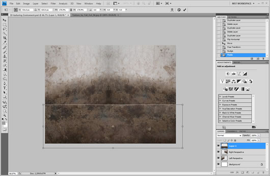
After we have it upscaled, we will move it last to the layers panel so that it is behind the wall textures, we will also name it as floor
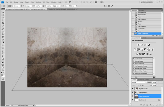
Once again we will click Edit -> Transform -> Skew. We will drag the left bottom square to the left and the right bottom square to the right so as to make the whole layer looking more leveled and look like an actual floor.
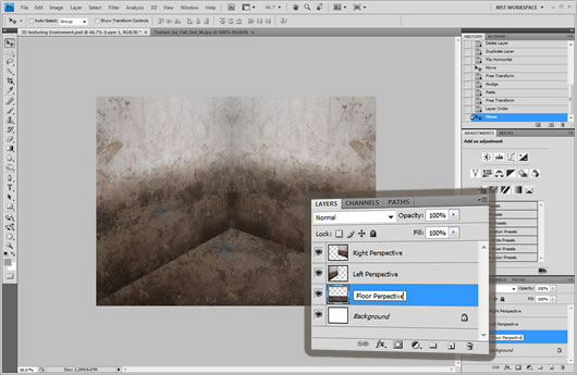
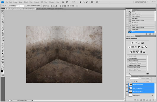
Now we can drag all the layers and position them where we want. We can make more space by moving them up or reduce some of the wall sizes by moving it left or right.
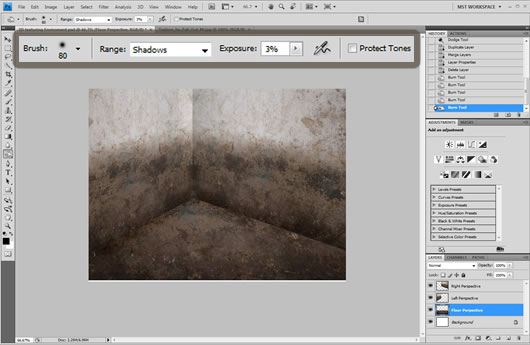
Using the dodge tool set to highlights with exposure on 10% and for cs4 users protect tones unchecked. We will apply some lighting on the right edge of the left perspective layer. This way we will separate it more from the right perspective.
With the burn tool set to shadows, exposure 3% and protect tones unchecked, we will apply a soft shadow on all 3 layers at the point where they connect.
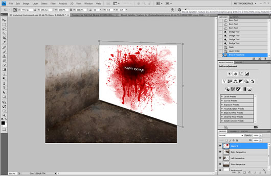
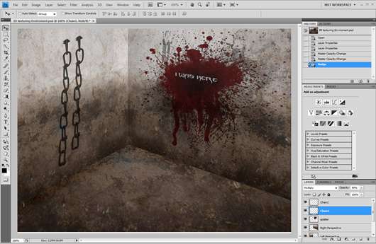
We can also add some realistic marks on one of the walls. For this we will need some white text and a splatter texture. The font used is called Blade II and is attached on the end of the article.
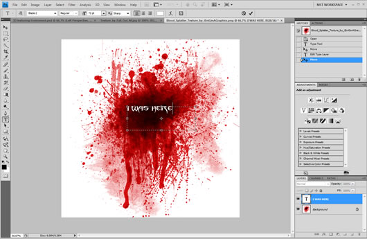
We will merge both layers and copy paste it to our document. If the image is too big it may need some downscaling, we did this just before with Edit -> Transform Scale.
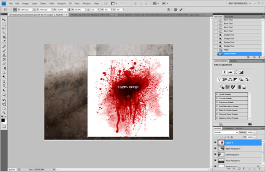
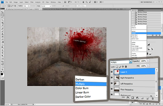
Using The skew tool for one more time we will adapt the image to the perspective of the right wall, like shown in the image:
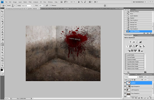
Then from the layers panel we will set the image to multiply.
Finally applying the desaturate tool in default options 2-3 times will help the splatter looking more to the theme.
Using the same way and effects like the splatter we can add some objects as well.
Multiply, desaturation and skew.
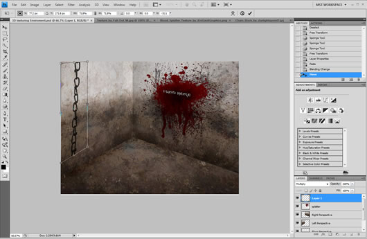
We can also erase some parts and add some 90% transparency to the objects.
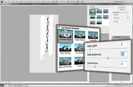
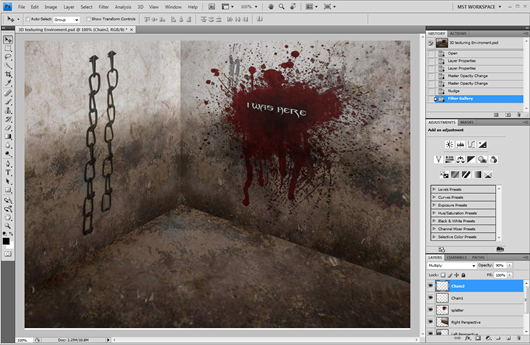
Finally we can add some extra depth to the second more far from our point of view chain, we will click Filter -> Filter Gallery -> Accented Edges with edge width set to 2, edge brightness set to 28 and smoothness set to 4.
The final Result should look like this :
DOWNLOAD: PSD FONT
RESOURCES: Texture Blood Splatter Chain


very good tut. I gave you some idea have some drop shadow it is most beautiful but any way thanks for sharing this kind of tut.