How to Get Inspired for the New Color Palette
2An important part about running a website is keeping it fresh. Most webmasters and blog owners will either create or commission a new website layout design, including a fresh color palette, once a year. Some will change it every season to match with events like holidays or just general shifts in the tone. Others might just change the color palette on the same layout, shifting the scheme for a new look from time to time.
Whether you are the site owner or the graphic designer hired for the project, here are some ways you can get inspired before you get started.
Related posts:
- 22 Must-Have iPhone Apps for Designers
- Casual Dining Restaurant Web Design: A Tour of the World
- How Does a Color-Blind Visitor View Your Site?
- Best Web Design Practices for the Start of Year 2011
- Unbeatable Android Apps for Graphics Designers
- 40 Nice Colorful Abstract Backgrounds and Tutorials Round up
Places to Find Inspiration
The web is full of places to go to be inspired to create in any medium. When it comes to color palettes you can technically find help anywhere. All it takes is a search through Google Images to see the way color can be used. But if you want something more targeted that breaks down palettes and even gives you access to certain colors, here are the sites for you.
Kolur
This excellent site has found a way to present color palettes in a creative and interesting way. Instead of giving a strip of color or a few dots, it has incorporated those schemes into actual pictures to show how they can be used. Its gallery is full of unique images that have perfectly incorporated even the most obscure palette collections. Under each picture is the standard presentation of colors used in the picture. It also links to a free app called Pixie that “steals” colors from any image to use.
ColourLovers
Taking advantage of the social media craze, this site allows users to sign up and share their color schemes and talk about the latest trends. It has several categories, such as Wedding, Home, Fashion, Web, Print, Craft and Business. Everything is archived and easy to search, and it has a very active community as well as a large list of handy tools that can make the process of finding and using palettes much easier. It also now has a marketplace of handcrafted items and designs, if you are interested.
Kuler
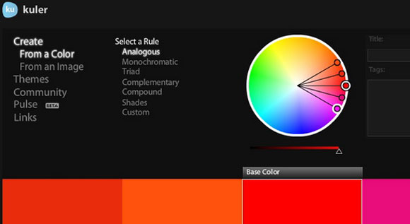
Create your own color palette using this awesome generator. You can do it from a color, an image or a theme. Then select the rule – for example, monochrome or compound. From there you can make a scheme of up to five colors, selecting any as a base. Then find the correct shade and tone to offset it perfectly. If you sign up for a free account you can save your scheme to use later or share it with the Community. Be sure to check out the beta version of Pulse, a global share wheel that shows the colors generated by members that you can view, duplicate or adjust.
Wear Palettes
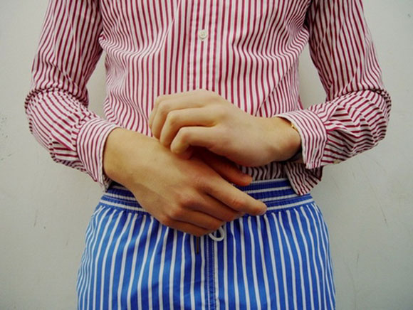
Sometimes the best place to find inspiration is in things we view every day. That is where this site comes in, following that principle and using it to create a great way of discovering color palettes. It has Street Color (generated from random street outfits), VIP (generated from celebrity outfits) and Plants (green interiors). All are presented with artistic photographs along with a strip of the dominant colors in the scheme. You can search by post tags, which have been broken up by color.
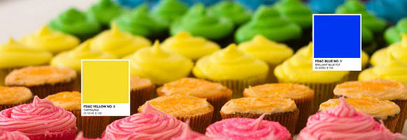
Edible Colors
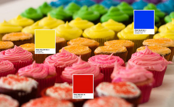
You have probably heard of Blue No. 1, Yellow No. 5 and Red No. 40. These are three of nine dyes (two of which are limited use) that are authorized in the United States by the FDA to color food products. They are also the three most popular, given they are the primary colors in dye form. This post shows how you can use these rich colors to create simple but dynamic palettes.
Sunsets
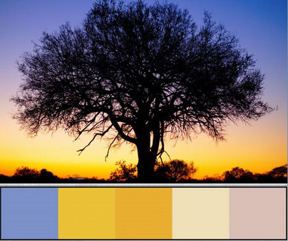
Sunsets are one of the most beautiful natural phenomenons in the world. Capturing their beauty is not always simple, which is why this is such a great blog post. It has taken some amazing photos and broken down the major color tones to create a large number of gorgeous palettes. Some are dark, some are light and most are somewhere in the middle. But they are all so gorgeous that there is no way you will be able to look at them and not feel inspired.
Current Trends
We are right at the beginning of 2012, and we are already seeing last year’s predictions for the current trends coming to pass. Here are a few you might want to take advantage of.
Coffee Palettes
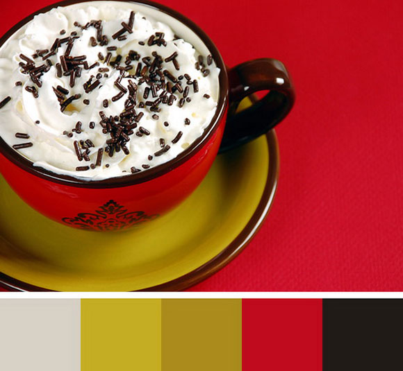
Coffee-inspired trends are really big this year. Web designs have been using the natural, rich browns for stunning designs, with an offset of foamy whites and creamy beige – all along with bright colors like reds and yellows that mix very well. This post shows different images that really show off the color capabilities of this palette.
Preservation
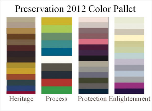
Benjamin Moore is well known for his color forecasts. This one is based off of a concept of “cultural architects.” It promotes the idea of connecting with and protecting the natural world. Each palette represents another element of this idea, creating one of the more fascinating of his releases.
Pantone
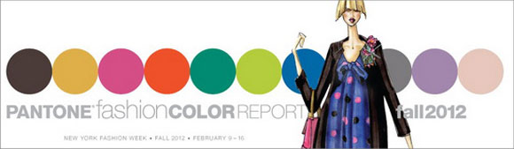
Another well-respected source, Pantone came up with nine palettes for 2012 that have been well received and used as much in graphic design lately as they have been in other decor. They are mostly midtones and would make a gorgeous collection for any layout.
Conclusion
You can find inspiration anywhere, but these are some good places to start. What are some of your favorite sources for palette inspiration? Let us know in the comments.


For me I often prefer to be inspired from others works, so I can visit DiviantArt for example, and also I use COLOURlovers, it’s a great tool.
Your post was very informative, thanks Tom.
Thank you for such a colourful post! I spend quite a bit of time on Kuler for colour inspiration, and of course Pantone (that is a bride’s fave!) but I am thinking I’ll be spending more time checking out the local cupcakeries for inspiration. 😉
Cheers from Vancouver, BC!
PS You’ve been bookmarked. Great site. 🙂