Understanding the Responsive Web Design
2Today, mobile devices like smartphones, netbooks, cellular phones and tablets are increasingly being used to browse the web. Until the unveiling of responsive web design,
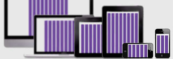
websites which were designed to be displayed on personal computers using different browsers like Chrome, Internet Explorer and Firefox could not be read or accessed using mobile phones. Thanks to responsive web design, mobile website access is now not only realizable, but easy and hassle-free as well.
Related posts:
- Tips for Building Professional Web Portfolios
- Are Web Designers Required to Know How to Code?
- Protecting Artwork Copyrights, Think again!!
However, for responsive sites to function effectively they must have three primary features:
1. Flexible Grid
The best way to achieve a flexible grid for your website design is to personally code or define the columns, containers and spacing of the site. This is because most available premade grid systems define alignment, space and size using CCS classes, which can be quite restrictive. As such, it can be quite difficult and time consuming trying to apply these defined limits in a responsive design, as compared to making your own custom grid.
The most important aspects of flexible grid systems are spacing and layout sizes. These aspects must be carefully considered irrespective of whether you are using a custom grid system or a premade solution. Making a flexible grid therefore means abandoning pixels and using web layouts instead, which use relative measurement units such as em’s and percentages. This, however, does not mean that you stop using pixels when working with image editing software like Fireworks and Photoshop. Instead it means that a bit of basic math involving converting pixels to web layouts with relative measurement units has to be employed when working on a responsive design.
2. Flexible Images
The images used in a responsive web design must be able to scale and move with the flexible grid created. Heavy oversized images tend to affect the loading speed of a website. That is why more and more websites are reducing the number of images they feature to only the most necessary ones. A substitute to scaling down images is using CSS to crop images. A CSS overflow feature allows you to dynamically crop images as the surrounding containers shift in response to a new display environment.

Another alternative is to have several image versions on a site server. The most appropriately sized image version will then be displayed depending on the device being used by the user. The client-side or server-side detection feature along with DOM manipulation can be used for this purpose. The final option is to hide or block images when non-image content is desirable.
3. Media Queries
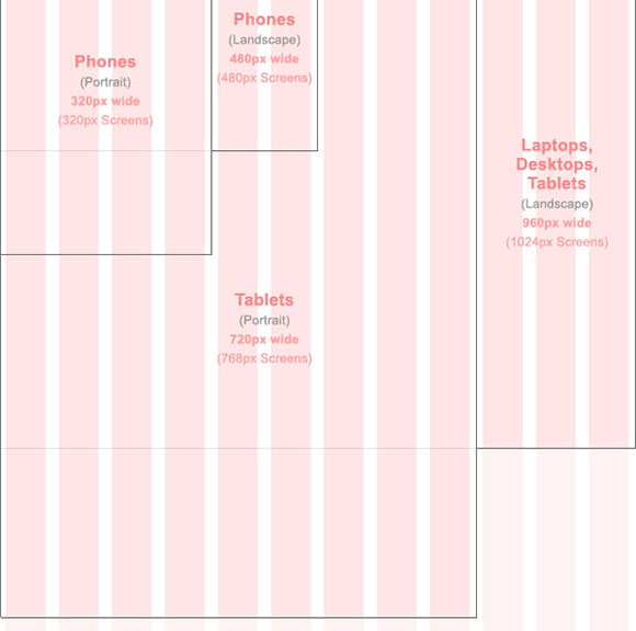
Media queries enable website designers to use similar HTML documents to create multiple layouts by serving stylesheets selectively. These stylesheets are based on features of the user agent like the window size of the browser among other parameters such as screen color, resolution and orientation (portrait or landscape).
As much as media queries is an exciting feature in responsive web design, it is only helpful if it is used once a reliable CSS and HTML foundation has been implemented that features a flexible grid and flexible images


responsive web designing well explained in your post. the picture in your made a clear picture how is going to work on different devices.
Thanks.. Emma, UK
[…] web design is the development approach that creates a single design using a flexible grid that allows websites to shrink or grow depending on the size of the device they are being accessed […]