5 Color Combinations that Web Designers Should Use
0I’m sure that you, as a web designer, have been faced with the matter of choosing or combining the colors for your website, so that your audience will be attracted to it. This is quite a tricky thing to do, which could cause you some troubles, but if you will get as many information and if you will pay attention at the following lines, then I’m sure that this problem will be solved.

In this article, I desire to focus more on the combination of colors, so that you will be able to create innovating, interesting and beautiful layouts. This means that in the lines that are to come you will learn which colors are best for various themes, what is the significance of certain color combination, and so on. I’m sure that this is something that is of maximum importance for you too because as many web designers you desire the website you create to be successful and appealing.
Related posts:
- What Designers Can Learn From Wildlife
- Tips for Building Professional Web Portfolios
- Are Web Designers Required to Know How to Code?
- Useful Online Graphic Design Resources to Improve Your Skills
- How to Avoid Losing Time for Freelance Designers
- Protecting Artwork Copyrights, Think again!!
The importance of combining colors
The first things that people see on a website are the colors. As you well know, every hue represents something and has a specific significance. The beauty of combining colors stands in the fact that this process will open the door to a world full of live, vivacity and interesting new meanings. I know for sure that this is what you would like your website to represent, so you should definitely get to work, be creative and start playing with colors.
Tools you could use
However, finding the right combination is not as simple as it seems. There are a lot of colors you could play with and making the right choice, could be very tricky and complicated. But, fortunately you are not helpless in this situation; on the contrary, nowadays your work is simplified due to some color palettes and color scheme generators. With the color palettes you will have to choose the colors manually, while with the color scheme generator you will receive a bigger help, because it will generate the right color combination for the colors you have chosen.
Some great tools that will prove to be helpful are: color blender, color Jack, color combos, color mixers, and so on. Just, give it a search on Google and you will certainly find what you need. Anyway, my favorite tool is Degraeve Color Palette Generator, which helps a lot the web designer that must create a website matching an image key. You will need just the URL of your image, which you must enter in the program and then you will obtain a color palette matching your picture.
Color schemes and their associations
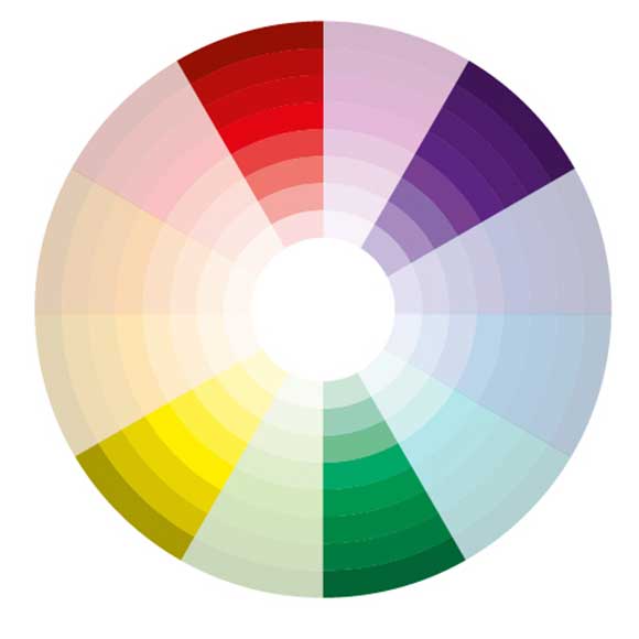
1. Monochromatic color scheme
In this quest of helping you find the right color combinations, I thought it would be best if you learnt something about color schemes and their associations. To begin with, there is the monochromatic scheme, which displays various tones of a single color. Also, you should know that if you are designing a website about weddings, or something that inspires purity, harmony or love, you will never fail if you would go for this scheme. Why? Well, mostly because monochromatic color schemes are associated with such notions as: elegance, clean and tranquility. Beware: it is advisable to combine such tones with pure white or pure black, in order to avoid the appearance of a boring website.
2. Adjacent color scheme
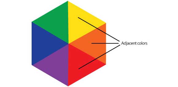
Those colors that are next to one another on the color wheel (such as: green and yellow or purple and magenta) are also known as adjacent color schemes. The characteristic of this scheme is that one of the colors has some of the other in it. These colors could be defined as harmonious and versatile. Also, because they are found in nature and they give pleasure to the eye, they are appropriate for websites concerning nature or those that need to be colorful without leaving the impression that they are overloaded.
3. Complementary color scheme
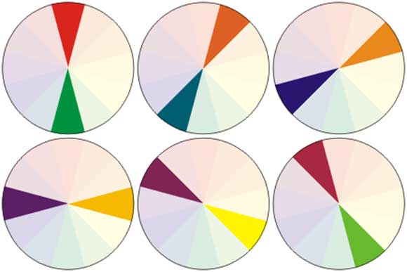
They say that opposites attract, well the same happens in the case of colors. To be more exact, when the colors that are on the opposite ends of the color wheel are combined they form the complementary color scheme. This is exactly what you should use, if you want your website to get a dramatic, intense and eye-catching touch. However, it is highly advisable not to use such colors for texts, because they will definitely bother the eye.
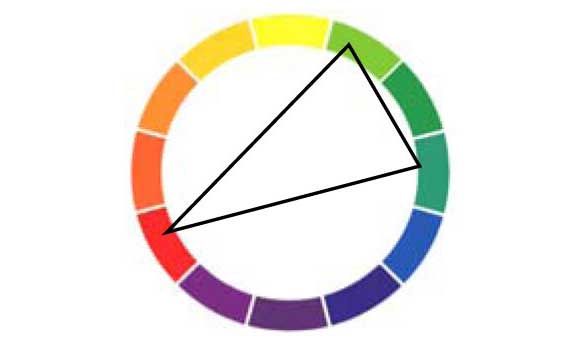
A color scheme that many artists use is the triadic one. By triadic color scheme one refers to three colors that are equally spaced on the color wheel and, if one wants to place these colors one should use a triangle of equal sides. If you want to use this scheme on your website, then you should remember to pick one predominant color and also to combine your hues with gray values in case they look too bright.
4. Tetradic color scheme
If you take four hues assembled into two complementary color pairs, you will get a tetradic color scheme. This is ideal for websites that inspire energy and vividness, because it offers color variety. But, the down side of this scheme is the fact that it is the most difficult to balance. However, there are a few tricks you could use: you may either try to subdue one or more colors or you could avoid using pure colors in equal amounts.
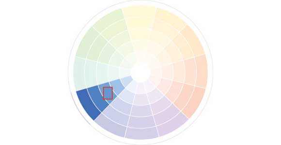
5. Split complementary scheme
If you are a beginner in web designing than the best choice for you would be to use a split complementary scheme. It is made up of analogous and complementary schemes so it displays a quite beautiful image. They are less tensioned, less vibrant and they grab attention. Although they are difficult to mess up, they have a high contrast and they can be hard to harmonize.
In the end, you must always keep in mind the fact that colors are important for your website and that you must combine them in an intelligent manner. Try not to create over loaded layouts that are full of colors, because they will bother the eye, but also avoid boring color schemes, because they will make you lose your audience.