The Principles and Benefits of a Minimalist Web Design
3Minimalism is not just a way of life. Many web designers also embrace it as a design principle. By weeding out unnecessary excess, minimalism in web design helps the Internet combat information overload. This may even partly explain the latest clutter-free redesign of data-heavy websites like Mashable and GigaOM.
Minimalism strikes a balance between utility and simplicity. It’s not about thoughtlessly reducing web design elements or removing them altogether, it’s about simplifying web pages to make them more useful.
Related posts:
- What Designers Can Learn From Wildlife
- Tips for Building Professional Web Portfolios
- Are Web Designers Required to Know How to Code?
- Useful Online Graphic Design Resources to Improve Your Skills
- How to Avoid Losing Time for Freelance Designers
- Protecting Artwork Copyrights, Think again!!
What’s Minimalism All About?
Minimalism in general is the use of the fewest or barest possible elements without sacrificing the essence of a thing. Think of a bicycle as a feat of functional and minimalist engineering. It has a frame, two wheels, brakes, a saddle area, a chain and chain rings, a pedal, a handlebar, and so on. It needs nothing more to run as long as it has its basic parts. Engineers can vary the bike design or use titanium for a lighter and stiffer frame but the bike will still get you from point A to B.
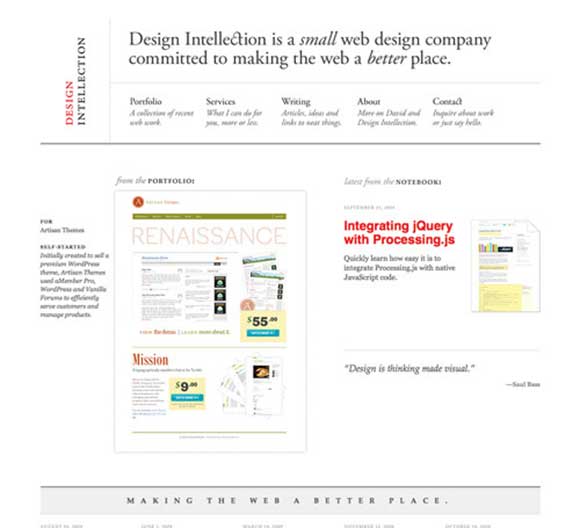
Minimal web design example by Design Intellection
Minimalism, in web design, also combines simplicity and utility by paring down web pages to just basics. Instead of using pre-designed templates, a minimal web design starts with a blank slate and only adds what’s useful.
It’s an exercise in restraint and good taste. The final goal is to help users focus on what’s important and achieve tasks more efficiently, expending as little effort as possible.
Minimalist sites are notable for their fast load times and clean typography. Here are three things to keep in mind if you want to design one.
Focus: What’s the most important thing to highlight? This is especially important when designing a landing page or an e-commerce web page. Your design has to focus around meeting users’ expectations and goals. Knowing what to focus on will help you keep users engaged.
Usability: What are the appropriate elements for the page? What elements can you add to make it more user-friendly? Can you simplify these elements without sacrificing their usefulness?
Balance: Do the components in your web page have appropriate visual weights? Make sure you achieve an equal distribution of visual weight. Consider the colors you use and the shapes and sizes of each element.
Why Use Minimalist Techniques in Web Design
Minimalism in web design isn’t a passing trend. There are valid reasons why a lot of web designers embrace minimalism. They all boil down to the advantages both users and designers get from a minimal web design.
First, a minimal web design usually needs fewer HTML elements, CSS rules, images and so on. This means faster load times, better front-end web performance and improved user experience.
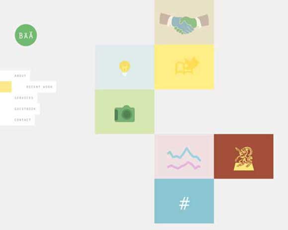
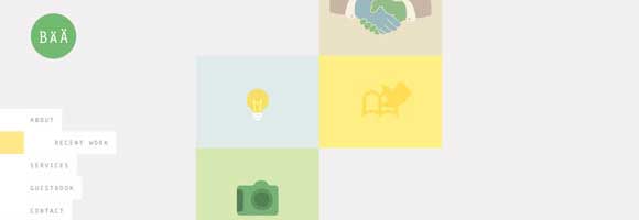
Minimal web design example by Barntarnst
Fewer codes, however, doesn’t mean easier design process. Minimalism takes just as much effort as any other types of web design. Since most of us are wired to adding instead of subtracting, it may even demand more effort from the designer.
Second, content is emphasized and optimized due to the lack of excessive design elements. Minimalism gives pages breathing room through its intelligent use of white space. Using the right combination of fonts, these pages fare better in terms of readability. Readers are not easily distracted by other elements in the page and can quickly consume content.
Minimalism Considers Usability Too
Effective and minimal web design doesn’t sacrifice usability just to meet requirements of simplicity. That’s because minimalism in web design is concerned with both form and function. Not only will it make use of white space and clean typography, it will also consider navigation and content accessibility.
Minimalism as an Aesthetics
Minimalism is not just a design principle. Web designers who embrace it as an aesthetics were successful to design minimally and beautifully. Because they only utilize a few elements, they’re able to get rid of distracting elements and highlight subtle yet remarkably beautiful ones that would otherwise drown in clutter. But don’t aesthetics fool you. If you’re planning for a minimal web design just for its looks, you’re missing the whole point of minimalism. Make sure you understand what your goal as a web design is and start from there


I’m a big fan of minimal design!
Keep it simple as they say in the trade?
Well written article, presenting good information on a key design trend, and minimalism is definitely the way to go.
As developers, website owners and ultimately users push for a better performing Web, with faster loading pages and great user experiences, minimalism definitely holds an answer to this question.
Keep it simple, yes… definitely.
[…] 8 UI. But minimalism doesn’t mean a title in Helvetica and not much else, it’s a focus on simplicity and cutting the clutter. Website owners can benefit from applying these principles to their […]