Ultra Thin Fonts: 10 Awesome Examples of Usage
3Thousands, if not millions, of font choices are currently available for you as a designer. However, not all fonts are created equal. Extra thin fonts are on the rise these days, with many designers finding them to be the perfect complements to their unique ideas.
If you want to keep your designs light, airy, and inviting, many font choices are available to achieve this purpose. Consider the following extra thin fonts for your upcoming design projects if you’ve grown tired of re-using the same fonts currently in your type arsenal.
Related posts:
- Best Usable Free Fonts of 2011
- Free Fonts to Use in Your Design
- 20 Fresh and Free Graffiti Fonts to Download
- 20 Free Fonts for a Youthful Design
- 10 Funny Type and Typography Tools
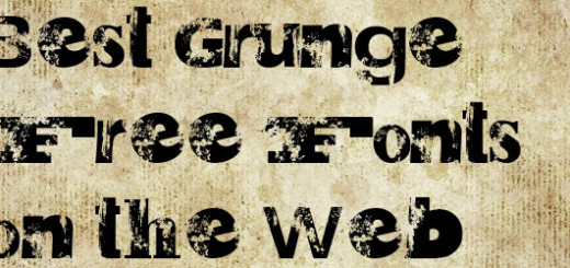
- Best Grunge Free Fonts on the Web
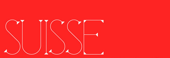
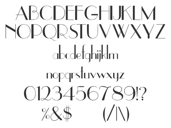
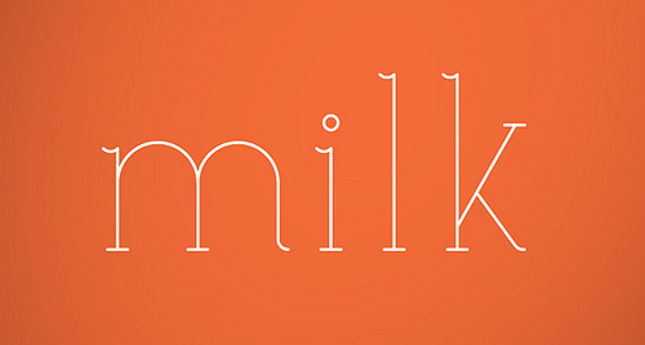
Ultra-Light Sans Serif
Modern, light, and minimalistic font is a very popular current design trend. By incorporating the following font into your designs, you can keep things light and airy while also taking a modern, trendy approach.
Delicate Serif
Serif fonts are the perfect options for many design projects but some are simply too heavy on the stroke weight. If you want to use a serif font but also need to keep your project light in nature, consider the following choices to achieve the perfect desired result.
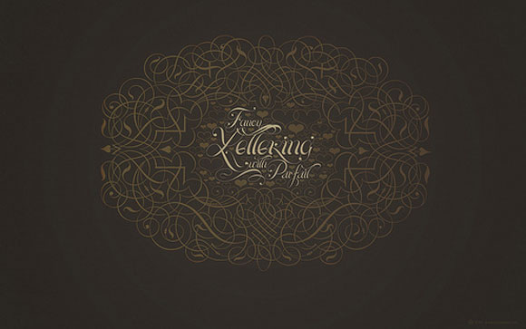
Dainty Scripts
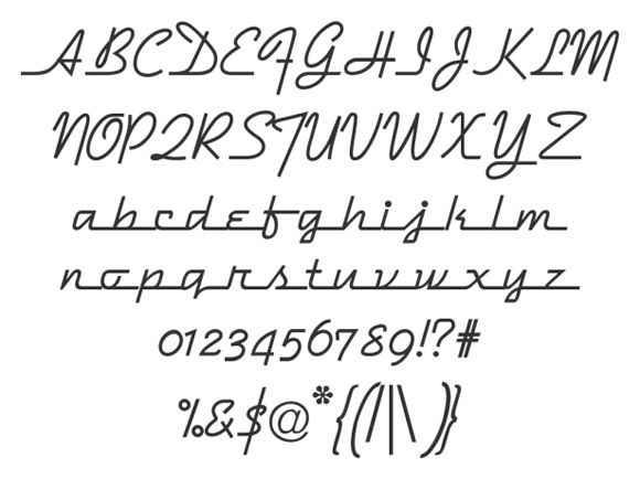
When thin fonts come to mind, they often elicit images of dainty, flowing typography. If you want to deliver on this traditional image, check out the following thin script font. The Dymaxion Script font is beautiful and airy, promising to deliver the perfect elegant touch.
Thin Contrast
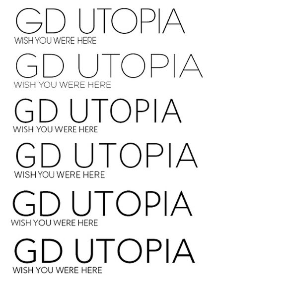
Few things are as impactful as contrast fonts. While you may desire a light feel for your next design project, you may also want to incorporate some weight. If this sounds like the effect you’re trying to achieve, use the following high contrast thin font to get what you need.
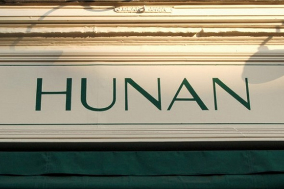
Thin Slabs
Slab fonts wouldn’t traditionally play in the extra light font’s playground. However, the following options show interplay is not only possible, but desirable.
Retro
Retro fonts often ignite fond emotions to design viewers as they recall memories of days gone by. Play upon those intense emotions with your designs by using the following light vintage inspired font. Both extra thin and awesomely retro, the Riesling font is worth checking out.
Playful
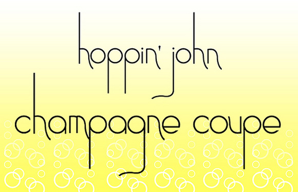
Extra thin fonts lend themselves perfectly to playful uses. These three light hearted options are great when you’re attempting a more playful approach to an upcoming project. Whether designing a project for an upcoming benefit or catering to the children’s market, extra thin, playful fonts are the way to go.
Fonts should never be used without care or an idea of which direction you want your designs to take. Extra thin fonts are great options when you want to coax viewers into your design and gently urge them to take in the information you’re providing.
As the above examples show, you aren’t limited to straight, low-contrast fonts when it comes to extra thin options. From playful to elegant and everything in between, the extra thin font market abounds with possibilities.

thanks for your collection.. thin slabs is the best amongst all.. do add titillium regular.. it can be a good option over here… i found it here… http://www.yhyqart.com/2011/12/08/free-download-light-thin-fonts-small-witty-quotes/
Thanks for posting
What’s the fist font name on the list “SUISSE”?